
For earlier entries “Against the Corona Panic,” see:
Parts One, Two, Three, Four, Five, Six, Seven,
Eight, Nine, Ten, Eleven, Twelve
____________
The “CoronaPanic” marches on. It consists of, is driven by, and/or is propped up by a combination of: Fiasco, farce, fascism, failure, fantasy, fanaticism, and a ferocious fit of feeling-over-thinking.
While there is a flu pandemic going on, we now know it is a minor and rather unremarkable one. (Opinions differ on just how unremarkable; Dr. Knut Wittkowski, a hero of the hour, has recently suggested it looks a lot like the Swine Flu pandemic strain of 2009-10 in its true ‘hit’ potential.) The virus’ impact is dwarfed by a parallel force which I will capitalize for effect. Think of it as: the flu pandemic vs. The Hysteria Pandemic. An abbreviated way to refer to the latter is “the CoronaPanic.”
The CoronaPanic is as a demonic entity that has forced its way into our reality. In this post, I want to show the difference of the immediate effects of the flu pandemic vs. The Hysteria Pandemic, as observable in New York City (jump to the section on New York).
____________
A brief word on why I am writing this series of posts.
I believe the fight against the CoronaPanic is a duty for “those of us who can see.” There remain cynics who continue to believe that the best thing to do is “beg the demonic force of the CoronaPanic for table scraps as it feasts on our national soul.” I deal with this in Part II (“Say ‘No’ to jockeying for political advantage on the coattails of Corona Hysteria”).
The evidence we have continues to be against the pro-CoronaPanic side’s alarmist predictions and apocalyptic views, as is observed reality everywhere, including/especially in the case of Sweden, the greatest hero of the hour we have (Update 4/29: See also Sweden Fully Vindicated; Graphing Sweden’s near-Complete Epidemic). The continuous stream of good news never seems to actually make its way into discourse, which is well and truly surreal to observe.
As one of the editors of OffGuardian, Kit Knightly, recently said:
“The most peculiar thing about COVID19 so far has been that they are not hiding the data […] The data is right there, and yet it is separate from the narrative, which never references the data; the data never references the narrative. What you have to do is basically ignore everything the media says, and just look at the numbers, and…where the numbers come from.”
Many of us realized this at about the height of the Panic, but the initiative had totally been lost to the Corona-extremists, who were enabled, if not led outright, by the media.
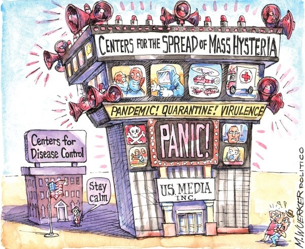
Why is the media ignoring the data and pushing a largely-data-detached narrative of cherry-picked, “scary-looking, big, contexless numbers“? Maybe it’s out of garden-variety ignorance; maybe it’s that they know better but have caved into the group-hysteria and group-think; maybe it’s out of a very cynical desire for the crisis to be as bad as possible so that they look good, even heroic, for reporting on it. I believe all of the above are true, and they partly explain the media’s disgraceful role in promoting CoronaPanic, which is nicely depicted in this image:
One way or another, to entrust the media with your Corona news is to entrust the henhouse to a team of foxes.
If the media “throws a number at you,” the simple act of asking basic, critical questions is often enough for the narrative to unravel in front of you. Which is what follows about New York City.
The surprise. In the search for answers, you can/will find hidden stories, such as the one I am going to try to tell below, in which we can tentatively quantify the impact of the Panic vs. the impact of the virus. The surprise is that even in terms of immediate-term body count, the Panic is much worse than the virus, the cure much worse than the disease for the body-politic; the net-losers, almost everyone.
_____________
The Coronavirus in New York: Piercing the Numbers-Fog
A commenter on the previous post (“‘Just the Flu’ Vindicated“) asks:
[W]hat do you make of the New York news release claiming 24000 deaths since March 1, which supposedly is 4 times normal. Is this true?
(– MattinLA)
Good question. Given the sensationalist way the media has covered the US hotspot of New York City, there is no better opportunity to look for context, to practice the art of critical inquiry, to ask basic questions.
In an introductory section to the “Just the Flu Vindicated” post, I wrote about the media and the pro-CoronaPanic side (but I repeat myself!)’s “Scary-looking, Big, Contextless Numbers” tactic. The alarming-seeming numbers out of New York City are a good case study of this phenomenon. Twenty-four thousand!
MattinLA asks whether it is “true” that there were 24,000 deaths up to April 22. I don’t doubt that the 24,000 coronavirus-positive-deaths figure is true, in the sense that they have counted 24,000 bodies since March 1 which were positive for the virus. But this is not the same as 24,000 coronavirus-caused deaths, and in any case the number 24,000 itself needs context to have any real meaning.
What does the “24,000 deaths” figure mean?
As a first-off, bird’s-eye-view, one-line response, I’d offer this:
What a number like that (24,000) more likely shows is that the virus was/is widespread in the population at a given time that those ‘positives’ were logged on the death rolls.
In statistics we run what is called a Null Hypothesis test. If we assume the virus has a <0.15% fatality rate in New York, can we use the data we have to definitely reject that “null hypothesis”? It looks unlikely. (cf.: Austrian researchers have found that in their country’s case, the null-hypothesis that coronavirus-positives have been dying at the same rate as coronavirus-negatives in Austria could not be rejected; in other words, at the time of that study there was no firm statistical evidence for the virus being uniquely dangerous at all, in Austria at least.)
Put another way: Given that we have data out of a lot of places now that all suggests a fatality-rate between 0.02% and 0.2% (which is, embarrassingly for the Panic-pushers, within the normal range for flu viruses), which of the following is more likely on why we have seen a high number of deaths in New York City (although a fairly counted true toll is not 24,000; see below). Is it:
(a) that the virus in highly urban New York City spread more fully and sooner than it did in other places, and therefore has yielded more virus-positive deaths in roughly proportional terms to its spread, or
(b) that the virus is much more deadly in New York City than the same strain of flu virus is in other places, including neighboring localities, or
(c) that the data in NYC is right and the data most everywhere else is wrong; that only New York’s (seeming, at-first-glance) death figures are “true.” Most other countries, regions, cities, and testing authorities have either bungled their data, or are covering it up.
One of those three must be true. To immediately assume (c), to run with (c), brooking no dissent on (c), is the mark of the true “Doomer,” or CoronaCultist. The latter is someone so obsessed with the Panic that that they have effectively converted to a religion centered around it.
I believe the media’s default position is effectively a soft version of (c). They don’t say this directly. It is implied.
Few of the assumers of (c) stop to ask whether they have made a reasonable assumption. They start to love Corona in a perverse way. They start to their chains. Maybe it’s useful to think of it in terms of a “Corona Stockholm Syndrome” (ironically, the Stockholmers themselves proved ‘immune’ from this syndrome; see also Sweden Vindicated).
________________
Now on to analyzing the “24,000 deaths” number itself. First we should establish the base population. Reports are that it applies to the NYC metro area, not to NYC proper. I assume they are using the NYC Metropolitan Statistical Area measure, population 20.3 million.
The first question to ask is:
How many deaths are normal for the same time period?
This is to say, how many deaths are statistically expected for the period March 1 to April 22, for the NYC metro area, in a regular year (53 days of late winter, into early spring), absent a peak-flu-event? (and what about with a peak flu event?)
The number of normal-expected deaths for the NYC-MSA is probably in the vicinity of 25,000 to 27,000, if their death rate is in line with the national average. (If someone has the exact numbers of deaths for the same period in 2015, 2016, 2017, 2018, and 2019, those would be useful. I can’t imagine it will be far off 26,000.)
If, in February and March, this flu virus achieved the level of penetration in NYC that it appears to have done, a lot of the normal/expected deaths in March and April would have been “corona-positive” at death. They would have died imminently anyway, in many cases on exactly the same day and the presence of the flu virus is coincidental and did not contribute to death.
In other words, there is going to be overlap between the categories “normal deaths” and “coronavirus-positive deaths.” How much overlap is hard to say, but we know from elsewhere that it is high. It could easily be half (as it was in Hamburg, Germany, when they started dividing between “deaths with” and “deaths from” this much-hyped virus), plausibly even more than half (as seen in early reports in Sweden, which estimated up to two-thirds were “deaths with”). For simplicity of calculation, let’s say half.
Deaths could, therefore, not have risen 4x above normal because of the virus. If total deaths did rise 4x above normal, putting total deaths for the period at 100,000+, something else caused most of the excess deaths, because there aren’t nearly enough coronavirus-positive deaths to account for it. Epecially not when measuring deaths fairly (see paragraph above). This is the first hint that something dark may be going on here, the big surprise we find when we tug on the numbers: That the Panic has killed more people already than the virus.
I haven’t yet seen any official, all-cause-mortality data for NYC metro area for the CoronaPanic period. The New York Times published some graphs that appear to have been made by their staffers, manually adding all reported corona-positive deaths as marginal deaths onto a graph plotting a supposed historical-running-average; if so, that is dishonest but alas unsurprising for the way Corona discourse goes.
_________________
Conceptual categories for deaths during a peak-flu-event (and a Panic)
Useful would be thinking in terms of four categories of deaths, conceptually, all of which we can theoretically calculate when the smoke clears, and as for now make estimates:
- Corona-positive Normal Deaths;
- Corona-negative Normal Deaths;
- Corona-positive Excess Deaths….sub-dividable into: (3a.) those dying of a respiratory disease (some very large share of which may be attributed to “COVID19” during the epidemic); (3b.) those dying of, or primarily of, other causes, with the virus playing an ambiguous role at most;
- Corona-negative Excess Deaths.
The “24,000 corona-positive deaths” figure is distributed between categories (1) and (3). (1)+(2) must add to 26,000 (or whatever the exact number is of normal deaths absent a peak-flu-event temporary spike in deaths).
The deaths in “(3a.)” are true victims of the viral flu epidemic. In this case, because there was a Panic, the theoretically fully calculable figure of (3) must be treated with caution. The less-calculable figure (3a.) is what we are really after.
The deaths in “(4)” are unambiguous victims of the Panic. Reports are that hospitals in NYC have had record-low intakes, especially heart attack victims have dropped off. These deaths would not have occurred had a Panic been averted in mid-March. The Panic-pushers are responsible for these deaths.
The weeks-long, pro-CoronaPanic stranglehold on the media (looking set to last months more), and the successful pushing of the hysteria (see image above for an artistic reproduction) made many tens of thousands too scared to seek treatment when they needed urgent care.
Some thousands of these unlucky, frightened people will have died of (treatable) ailments like heart attacks. These are clear cases of “4.”
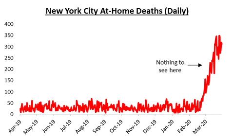
[Update (April 24):] Here is a graphical representation, found online, of the rise in “at-home deaths” in New York City. We know from much data elsewhere that coronavirus-attributable deaths very seldom occur at home, but are slow onset and victims are hospitalized first. It’s likely that the entirety of this excess is to people in category “4,” running hundreds a day for over a month:
The funny thing is, if someone dies in such circumstances — the heart attack victim who doesn’t seek help — and ends up positive for the virus at death, he still goes up onto the bloodthirsty media’s “Big Board of Corona Deaths.” This is a kind of ‘scam’ and bogus data that led some on the anti-CoronaPanic side to use the the term “Scamdemic.”
The practice of over-counting corona victims is satirically shown here, a jab at the pro-CoronaPanic side, circulating by early-mid April:

Some nursing homes have also been abandoned by cowardly, panicking staff (ultimately driven to the Panic by the media), and in such places there have been cases of elderly residents dying from lack of care. These deaths, at least some of them, are attributable to the Panic, not the Virus, mostly sortable into category 3b or 4.
What are best-guesses for the number of deaths in each category? If we have a known figure of 24,000 total Corona-Positive Deaths, and a figure of 26,000 Normal Deaths (recalling that these are overlapping), and if we have significant virus penetration/spread in the population which especially hit places like nursing homes where many are close to death in any case, the split may look something close to this:
Total Deaths in New York City metro area for the period (est.) (proposed):
- Corona-positive Normal Deaths: 12,000
- Corona-negative Normal Deaths: 14,000
- Corona-positive Excess Deaths: 12,000 (some unnecessary and caused by the Panic; 5,000-10,000 true coronavirus-induced deaths?)
- Corona-negative Excess Deaths: ? (all unnecessary, collateral victims of the Panic)
The (1)+(2) figure is 26,000 (the normal death rate), and here it is proposed 45% of normal-deaths were positive at death during the height of the epidemic, which may or may not run slightly ahead of the total-population penetration rate. It is reasonable to assume it runs ahead of the full-population rate because of spread within hospitals and other long-term care facilities with terminal patients whose time had come in March/April and would have come absent a flu-virus epidemic.
As for (3) and (4). If a Panic is ongoing, or there is some other non-virus-related mechanism causing excess deaths (in other words, if “(4)” is above zero), “(3)” must be subdivided. The force driving “(4)” will also be spilling over into “(3),” hence the proposed (3a.) and (3b.), which are harder to calculate. Just because you are positive does not mean you get a serious disease; very few do. But you might well still die of something else (like those heart attack victims who stay hunkered down at home) while incidentally positive and be an excess death.
To get a better handle on this problem, death certificate information would be useful. How many deaths were classified as “primary cause: respiratory disease”?
[MAJOR UPDATE (April 25): See a comment below. The numbers now released for deaths occurring through April 18, including average age for corona-positive vs. corona-negative deaths, place of death for corona-positive deaths, and deaths in New York City through April 18, corona-positive vs. corona-negative) offer strong corroboration for the contents of this post.]
______________
New York City at the cusp of Herd Immunity
If the number I propose there for “(1)” is correct, and such a large portion of corona-positive NYC metro area deaths have been in “people who were dying anyway” (suggested by, e.g., the report that half of corona-positive deaths have been to nursing home patients), this would mean the virus has reached a large share of the total population, something like 30% to 40% population penetration this writing. (= 6 to 8 million people in the metro area having had current or past contact with the virus), with terminal patients running ahead of that rate. If this is the case, we are once again down to the 0.1% fatality rate range for the virus itself.
Here is the calculation derived from the above:
<10,000 deaths in the NYC metro area fairly attributable to the direct effect of the virus
…divided by…
7 million people in the region whose bodies have had contact with the virus (@ 35% of metro area population of 20.3 million being either a past- or present-positive)
_______________
= ca. 0.1% fatality rate
…which is in line with the numbers out of just about every other large-area study since early April), and we are back to Just The Flu.
If the virus penetration rate is that high, it is good news, as it means New York City’s epidemic is already over, or very soon over, as they are at the cusp of Herd Immunity. It also suggests that the lockdowns were unnecessary and created a Panic that killed more than the virus ever could. A complete failure of policy, driven by a hostile media and cowardly or demagogic political leaders. If there are any responsible people left in charge, they need to take action to end the deadly and destructive Panic.
______________
Just how deadly might the Great Hysteria Pandemic (as against the lesser virus pandemic) have been?
On non-coronavirus-attributable excess deaths
Recalling the four categories of deaths again:
- Corona-positive Normal Deaths;
- Corona-negative Normal Deaths;
- Corona-positive Excess Deaths…sub-dividable into: (3a.) those dying of a respiratory disease (some very large share of which may be attributed to “COVID19” during the epidemic); (3b.) those dying of, or primarily of, other causes, with the virus playing an ambiguous role at most;
- Corona-negative Excess Deaths.
What might be the totals for (4), corona-negative excess deaths, and (3b.), corona-positive excess deaths not caused by a respiratory disease? Put more directly: How many people have the lockdowns already killed in NYC?
When we get final and confirmed total-mortality data for the NYC metro area, which may not be soon (if someone has this, please leave a comment), we can calculate (4) as follows:
[Total Reported Deaths] minus (1) minus (2) minus (3) = (4).
[Update (April 24):] Recall this graph from above:
[Update (April 24), cont.:] We see that excess deaths at home may have pushed up to 7,500, cumulative, by April 22, for NYC proper alone; this may need to be up to doubled for the NYC metro as a whole. Therefore 15,000 may be a ballpark-estimate for for “(4),” plus thousands more in (3b.), adding up to Panic-caused deaths at twice or three times the number of true, coronavirus-attributable deaths (or “3a” above). The lesson here is: It turns out that when a Panic is created, people take it seriously, and the outcomes can cause increased mortality in the immediate term.
[Update (April 25): See also how the above estimates all compare to the latest CDC data for all deaths through April 18. The latest data corroborates each of the findings of this post.
______________
The same phenomenon of Panic-caused excess deaths, documented in the UK
Figures out of the UK suggest “(4)+(3b.)” are at least as high as “(3a.)” in a high-panic place like New York City, and potentially pushing three times as high.
Health authorities in the UK estimate there have been more than 2,500 excess heart attack deaths in London so far, “excess” meaning those that would normally be treatable and make full recoveries but have instead died. (That is, since the bizarre about-face by the UK government, in which the government caved in totally to the Doomers and pro-‘Lockdown’ extremists [see also: UK Imperial College study shown to be laughably wrong]. In the words of anti-CoronaPanic expert Knut Wittkowski, the UK’s cave-in was based on “one person’s guesstimate” as other experts were sidelined or not consulted; a surreal episode and a disgrace to the Western tradition.)
London’s spike in total mortality, which drives the UK’s excess-mortality spike, is therefore largely explained by people too afraid to to the hospital when they needed to and dying easily preventable deaths, a fact now admitted in the Guardian (a sign that the pro-Panic coalition is fraying at the seams?).
The same holds true in New York.
Possible demographic factors in non-coronavirus-attributable excess deaths
A higher figure for “(4)” could partly indicate a low-trust population in the given area affected, one much less able to withstand any kind of stressor, less able to “come together,” one that may have little in common with each other, perhaps mutually suspicious of one another.
This general description certainly fits today’s metro NYC. A large portion of New York, especially in the outer boroughs, is all but completely devoid of Americans; it was here that the Panic may have struck hard and the people least ready for how to deal with the e social stressor thereof, and hunkered down, distrusting all and easy victims of the media-driven Panic. This produced bodies for the media in their bid to appease their new god; an evil self-fulfilling prophecy.
We also hear that as much as half of Stockholm’s corona-positive deaths at one point were to Somali immigrants, and a fair portion to other immigrants, putting ethnic Swedes’ total-fatality rate in Stockholm during the current flu epidemic at a very low level indeed, with deaths probably rounding to 0.0% based on the latest studies there. There may be something of an international pattern here.
The No-Lockdown Swedes have avoided much of a “(4),” as have other populations of higher social trust and regimes that blunted the impact of the evil-beast of CoronaPanic.
______________
The non-corona-attributable excess deaths: Whose fault?
What causes a man to refuse to go to the hospital when he has a heart attack? What causes an immediate-term death of despair?
It is no cosmic mystery that the cause here is the Panic itself, and so we must ask: Who caused the Panic?
The CoronaPanic-pushers, large and small, in the media and elsewhere. The Corona opportunists, large and small, especially what I call the the Corona Coup d’Etat faction, which is to say many political leaders. (A great case has been made in OffGuardian today for the Corona Coup d’Etat Hypothesis).
(I wrote previously on the “Who is Responsible for the Corona Panic” question, March 26.)
The surprising finding that has emerged, in clear view by mid-April, and clear in the New York City data, is that the Panic-pushers have already killed more people than the unremarkable flu virus ever will, at least in certain hotspots. This is humbling, and enough to make the anti-CoronaPanic side redouble its efforts that we may be liberated from this “mind virus,” as each day it does more damage.
The hard times for us the living are yet to come, and will tower over the short-term hit in Panic-caused deaths (The Mass Hysteria Pandemic) that was a focus of this post. More and more are seeing this as among the most extreme cases of “burning down the village in order to save it” in our times. Aggregate life-years and life-year-equivalents lost due to the the effects of the Panic will exceed those lost to the virus by hundreds fold, and plausibly even thousands fold. A complete defeat for the pro-CoronaPanic holdouts. May they see the light.
None of this needed to be. May the guilty be disempowered and live out their days in shame; may the rest of us learn the right lessons that this never happen again.
__________________
_________


“May the guilty be disempowered and live out their days in shame; may the rest of us learn the right lessons that this never happen again.”
I hope this happens but so far, they’re just doubling down on pushing panic.
Excellent post as usual. Thank you for doing this.
The “they,” or at least the most relevant one, is what I call the Corona Coup d’Etat faction.
Ditto of Federalist’s “excellent post”. This estimation you do is something I’ve tried to get across on unz to writers and commenters a few times and gave up. They will not quit believing the Infotainment narrative until, well, here’s what I see: Nobody will back down on your 3(b) numbers. There are a number of incentives, as we’ve discussed, that encourage these deaths to be marked due to the COVID-one-niner. However, what happens at the end of the calendar year, or end of ’21, when people see that the death rate in the country and even in the “hotspots” are no different from an average year, or worst case, a year with one of the typical flu epidemics.
So, I’ll just go on with more anecdotes on my site, as I am told anecdotes by true believers in, and frequent viewers of, this Panic-Fest. Which show the general picture, and which are cherry-picked? I’ve got a post coming today (if I can get past my income tax sub-fixation), on my experience with a family member in the health-care field. The regular thing now is to show me a story about someone who railed against this lockdown, then came down with the Kung Flu and kicked the bucket. They LUV these stories… maybe 1 or 2 comes out a day … out of HOW MANY PEOPLE LIVE IN AMERICA again? I asked her “hey, how many families were mowed down by drunk illegal aliens at intersections last week too?”
Anyway, thank you, Mr. Hail, for chiming in on Peak Stupidity and for doing these well-needed common-sense estimations to show what’s really going on. What we have here is a serious lack of perspective.
The quote of relevance I really like:
“I am convinced that the Corona mortality rate will not even show up as a peak in annual mortality.” — Dr Klaus Püschel, head of forensic medicine in Hamburg, Germany, speaking early April
Re: Peak Stupidity above,
Even in the morose “body counting” game itself (which is necessary given that the media does it, given that their ‘spin’ of cherry-picking etc. on the body-counting game prolongs the crisis, agitates the pro-Panic coalition into keeping up the pressure), the anti-Panic position wins, and has won decisively, to my view. (‘Won’ on the question of, “Is this virus uniquely dangerous,” etc.)
But the body-counting game is not fighting on the levelest possible playing field, I think, considering that the decisions related to this mass-hysteria event are affecting all of society, all of our futures, our nations’ futures, and so on. The fairer overall picture is the subtler “aggregate-expected-life-years” lost to the Corona Virus directly, vs. the same lost to the Corona Response. The result, any way you approach it, is so dizzylingly lopsided as to make even the most hard-nosed into a conspiracy theorist. None of it makes sense in a sane world.
I demonstrated yesterday to a pro-CoronaPanic commenter that just the number of net lost births alone (lost to the period of instability, panic, and the coming recession; see a previous post here at Hail To You on the effects on fertility of the 2008 recession [an across-the-board, sustained drop by several tenths of a TFR point]) will probably swamp, likely by literally hundreds fold, the number of aggregate-expected-life-years lost to the virus. That is just one simple calculation; adding on the many others, and you get a policy catastrophe that I would say is fairly labelled “unprecedented.”
I read your posts on the “lost year/days of life” calculations. I am very sure that, were one to go by these numbers alone, this LOCKDOWN crap would be proven to be a life-killer. I’m not sure if you even included a factor for years of productive/healthy life lost vs. time gained in a hospital bed with tubes and wires coming out of you in all directions.
The pro-panic population (there’s some alliteration for you, Mr. Hail) just cannot do that kind of math or doesn’t want to. PEOPLE! ARE! DYING! – shades of Greta, I wonder how much influence that stupid mistreated child has had on this latest stupidity, come to think of it?
You know my opinion already, which transcends the numbers argument, at least regarding the Police State stuff. Unless we have the next Black Plague going on, I see no call to implement a Police State, even if it would “help matters”.
Post updated with a graph of excess stay-at-home deaths for NYC since the Panic/Lockdowns began:
This corroborates the strong likelihood that the Lockdown has already killed far more in greater NYC than the virus has.
Given the average age-condition profile of the non-corona excess deaths being a lot younger/otherwise-healtheir than the average age-condition profile of true corona-victims (median age in 80s and with pre-existing conditions), the loss in aggregate-life-years attributable to the Lockdown, even measured in immediately-observed-deaths, probably already swamps the virus’ effect. The total aggregate loss from the Lockdown (see above) is going to tower over the virus’ direct effect by such a huge magnitude as to be stunning.
The Covid cookie is crumbling- get ready for some serious damage control. Paging Hill & Knowlton.
Illinois Director of Public Health Let’s Cat out of the Bag- COVID Deaths Are Overstated
Here is the exact quote from the director of Illinois Department of Health, Dr. Ngozi Ezike, transcribed from Illinois Governor’s health briefing on April 19th :
[i]”I just want to be clear in terms of the definition of people dying of COVID. The case definition is very simplistic. It means at the time of death it was a COVID positive diagnosis. So that means if you were in hospice and had already been given a few weeks to live, and then you also were found to have COVID, that would be counted as a COVID death. It means technically even if you died of a clear alternate cause, but you had COVID at the same time, it’s still listed as a COVID death. So, everyone who’s listed as a COVID death doesn’t mean that that was the cause of the death, but they had COVID at the time of the death.”[/i]
During Gov. JB Pritzker’s health briefing on Sunday, Dr. Ngozi Ezike, the Illinois Department of Public Health director, said anyone who had COVID-19 at the time of death, even if the person died of other causes, is counted among the COVID deaths.
In fact, even if a person is in hospice for other reasons but has COVID, too, that death is still counted among the COVID deaths, Ezike said.
https://www.theherald-news.com/2020/04/21/what-counts-as-a-covid-19-death/a38v0ed/
===========
Pennsylvania inflates COVID death toll- then reduces death toll.
Earlier this week, Pennsylvania started to include “probable deaths” in its fatalities. As a result, the total number of coronavirus deaths grew by 276, then 360, in successive nights, almost doubling the number of deaths in the state in two days. The Pennsylvania Department of Health subsequently removed 200 deaths from its count after facing mounting questions about the accuracy of the count.
Health Secretary Rachel Levine spoke to the Philadelphia Inquirer about the initial decision to include probable deaths, as well as the decision to later remove those from the count.
A “probable death” is one that a doctor believes is caused by COVID-19, even though the patient is never tested for the virus.
Article here:
Officials from the state Department of Health provided several justifications for the fluctuations, citing technical issues, lengthy investigations, and the addition of “probable” deaths — those considered to be caused by the coronavirus but without confirmation from a test.
….
But facing mounting questions about the accuracy of the count, officials on Thursday removed more than 200 probable deaths from the tally, further complicating the state’s accounting of the pandemic. Health Secretary Rachel Levine said the change was made in an effort to be transparent.
….
The confusion began Sunday, when Pennsylvania raised its coronavirus death toll to 1,112 — an increase of 276 overnight. On Tuesday, the department reported another spike, from 1,204 to 1,564 deaths. In both cases, Levine said the surges reflected deaths that occurred days, even weeks, in the past. “These deaths did not happen overnight,” Levine said Sunday.
On Tuesday, Levine reported 300 probable deaths in the day’s count but appeared to indicate the situation was new.
“We will now be reporting probable deaths related to COVID-19 in addition to confirmed deaths,” she said.
….
https://www.inquirer.com/health/coronavirus/spl/pennsylvania-death-count-changes-confusion-coroanvirus-20200423.html
Allen, I saw that you posted this same information at Moon of Alabama and the first reply you got was from that imbecile Jackrabbit who accused you of insulting his intelligence.
If this whole episode weren’t so terrifying it would be hilarious, but deep down I know this ends very badly if things don’t change soon. For what it’s worth, I’ve had several of my usernames banned at MoA since this all started, including my long-time handle “information_agent”, and part of me doesn’t even think b is at the helm there anymore.
Whatever is going on is like a runaway train right now, and the media has the fear needle pegged; I just wish I could convince people that what the media is actually doing IS the terrorism.
“If this whole episode weren’t so terrifying it would be hilarious”
Well put.
Interesting point re Moon of Alabama. I have been banned there, not sure why. However, since learning that B is a chain smoker, I can’t help wondering whether his very arbitrary and absolutist verging on weird stance toward Covid-19 isn’t partly due the fact that he himself is obviously in one of the vulnerable groups. I wrote him what I thought was a nice post, in German, saying that I felt sorry for him since he is clearly addicted to tobacco, and he could get motivated to quit if he read some websites that describe how *quickly* the body starts to heal itself after the last cigarette: namely, within 10 minutes the lungs start to heal. within an hour, the circulatory systems, etc. etc. So, he really should try to quit. Of course, I suppose the post went down the rabbit hole! Probably my email address is blocked.
Is Moon of Alabama among the places actively banning Corona Skeptics and anti-Panic people?
Good points on why someone might be motivated to join the pro-Panic side. I’ve also seen cases of vulnerable-group people also anti-Panic. The dividing line cuts a lot of ways.
MAJOR UPDATE (see the relevant section of this post for where this applies most directly)
The CDC latest info as of April 25 gives a firmer picture of deaths occurring for Jan. 26 to April 18, 2020, both corona-positive and total deaths:
___________
— Average age of all the coronavirus-positive deaths in the US: age 77;
— Average age of non-infant coronavirus-negative deaths in US: age 76.
(The above is my calculation based on this latest CDC total-mortality data for deaths occurring in the period; they do not give a single “average age at death,” but a series of ranges, in Table 2, from we which we can calculate those average ages. Whatever the exact number is, corona-positive deaths are +1.1 years older than corona-negative deaths.)
___________
— % of COVID19 deaths that occur at home (private residence): 17.5%;
— % of COVID19 deaths that occur at nursing homes: 15.5%;
— % of COVID19 deaths that occur in patients at healthcare facilities: 74.7%.
The “patients at healthcare facilities” will include previously hospitalized patients and new intakes who came down with this flu.
___________
As for New York:
— Total deaths, all causes, in New York City, Feb. 1 to April 18: 25,978;
— Total deaths, all causes, NYC for the same period, expected: 13,120;
— (12,858 excess deaths over a non-peak-flu-event baseline);
— of NYC deaths in the period, total that were corona-positive: 8,073 (31% of all deaths were corona-positive)
___________
Quantifying excess deaths caused by the Panic vs. excess deaths caused by the Virus in NYC:
We with data for New York City through April 18 (NYC proper, not metro area), we can “solve the equations” and say with some precision how many are in each category of death (see above) and what the true hit of the coronavirus is in New York City, and what the true hit of the loss of life to the Panic is.
Here are the four proposed categories again, proposed here to disentangle the corona problem and the significant muddying of the waters that occurs:
The CDC data for New York City, just released through April 18, can be used to calculate values for (1.), (2.), (3a.), (3b.), and (4.). With data to plug in, we are able to solve this as a math problem. There is going to be some uncertainty with exact values only for (3a.) and (3b.), so I will offer a range there.
Here we go:
— Expected deaths, NYC proper: 13,120 (CDC). This is (1.)+(2.);
— Excess deaths, corona-negative, NYC proper: 4,785 (CDC). This is (4.). So far, so good…
— Total corona-positive deaths, NYC proper: 8,073 (CDC). This is the sum of (1.)+(3.); of the 8,073, some large number are in the category “would have died anyway,” which is (2.). Others could be those who died of other excess deaths but that were not directly attributable to the virus’ direct effect, (3b.) here, as in a man who has a heart attack, stays home, dies, and at autopsy was found corona-positive (but no symptoms).
— The best-estimates range for “would have died anyway” corona-positive deaths: 1,975 to 5,250. This is (1.). The range is from if (low-end) 15% of expected-deaths [13,120] were positive at death vs. (high-end) up to 40% of expected deaths [13,120] were positive at death. The % can be assumed to be somewhat higher than than the total-population’s at this early point in the epidemic-arc (the midpoint of the measured period is early March), because of high spread in places with high near-near mortality such as hospitals and nursing homes; this is discussed in the main post and is uncontroversial;
— Having found (1.), we are ready to pull the trigger on calculating the range of true coronavirus-attributable deaths for NYC proper (not metro) for Jan. 26 to April 18: 2,825 to 6,100. This is (3a.) in the main post for NYC proper (not metro area). The fatality-rate of the virus is therefore <0.2%, and for an all-population sample it is probably down to 0.1% or even less. (This number of excess deaths attributable to a flu spike means deaths would be up +33% [ca. 13k to 17.5k], which is not much above several other flu spikes observed in the 2010s; see Against the Corona Panic Part III: Just The Flu Vindicated);
— This leaves us with finding the sum of Panic-caused deaths. Deaths that were corona-positive and for which there is an unclear, at-most-ambiguous relationship to the virus: 2,000 to 5,250. This is (3b.), simply the converse of (3a.), and applies to NYC proper (not metro area).
Now we can directly tackle the Virus Effect vs. the Panic Effect:
(4.) + (3b.) = ca. 8,500 (non-corona-attributable excess deaths)
(3a.) = ca. 4,000 (corona flu epidemic-attributable excess deaths)
= The Panic has likely caused at least 2x the number of deaths as the virus, based on CDC data.
This is very much in line with the contents of this post, which was based on tentative numbers and estimates.
How might we estimate “deaths with the virus” vs. “deaths from the virus”? Knowing that the typical victim is in his/her 70s/80s/90s (79% of corona-positive deaths were over age 65; 30% were over age 85), and knowing that the virus spread faster in nursing homes and hospitals, we know a large portion of these deaths, here as everywhere else, are going to be corona-positive but died of other causes.
By the way, only 2.8% of corona-positive deaths were below age 45 (presumably all or almost all with pre-existing conditions or people already terminal as in late-stage cancer patients); you may be surprised to learn that 5.9% of corona-negative deaths were below age 45 [excl. infants; rises to 6.4% with infant deaths]; see Table 2.
(The above paragraphs is an example of how the Corona Narrative tends to fall apart with context; the media never highlights things like this.)
___________
__________________
___________
Conclusions/Summary.
This latest data release, summarized and gone through step-by-step above, strongly corroborates this post’s main conclusions on New York City:
(1) The spike in deaths is more attributable to the Panic than to the Virus (i.e., deaths at home of people too frightened by the media panic to seek help for a heart attack or other emergency);
(2) Given that we now know something up to or exceeding two million in NYC proper alone have had contact with the virus (from the initial study commissioned by Gov. Cuomo pegged to April 20), even in New York City, observed deaths are consistent with the 0.1% fatality-rate range found everywhere else. The true number depends on exactly what share are “deaths with” vs. “deaths from.”
(3) The seemingly higher number of New York coronavirus deaths can be fairly called an illusion, in that: (a.) New York City has a lot of people, and (b.) New York City is urban, which means the virus spread widely, as all flu viruses do. The thing about all those other flu epidemics is that none has ever been tracked in real time like this, none has been subject to saturation media-coverage, or a mass Panic driven by a a criminally irresponsible media.On NYC specifically, I would also add a point-(c.) for what’s behind the illusion of NYC being particularly hard hit: A lot of media is centered in NYC, so they pump up the coverage of this flu virus there; a lot of personality-types love the attention, and the media is full of them).
The NYC mystery is solved. It's over.
Very good work there.
Here is an interesting tidbit- I looked into CDC “flu positives” over the last 20 years- exciting stuff- and manually graphed Weeks 6-14 of the last eight years. It’s amazing to see those 8 Tables in front of you. For every year the trends were the same even as the numbers varied slightly. This was true over the previous 19 years BTW. Only in the last 3 weeks of this year was there a change in those trends and it was a statistical deviation on the order of over 1500%- that is not a typo.
Flu positives in US as recorded by the CDC hit all-time record low in Week 14 of this year- the rate was listed as 0.8% by the CDC. All Week 14 “flu positives” in preceding years were in the double digits. To add to this point in only two weeks ever through this time frame, Weeks 6-14, did the CDC record a “flu positive” rate under 10%- those were 9.6 and 9.8%.
This 0.8% was over 1500% lower than their average Week 14 rates (13.5%) going back to when they first started charting this stuff 20 years ago.
AND all of this is after the CDC had recorded all time record highs of 30.8% flu positives in Week 6 of this year.
Where did those “flu positives” go. They can’t all be in lock down.
Allen, .
I believe you are suggesting that some of the COVID19 diagnoses, including many of those who diagnosed without being tested (this is apparently happening and is official), presented flu symptoms and were diagnosed on the spot as COVID19. If this is as it seems to be, it means other flu strains would have suddenly crashed, in the numbers. There must be something to this.
Could you link to the data source and graph you posted? Thanks
Hail,
If all goes well I will post them tomorrow. I’m the individual who created (or simply collated) the graphs- it took forever to look over 20 years worth of weekly reports from the CDC and compile the last 8 years of which the relevant weeks were placed in the graphs. I do everything long hand initially.
Another oddity, again when you see these numbers it is stunning, is that after Week 14 the CDC has stopped (and they made a note of it) meticulously charting the flu and their “Flu View”, which was their flagship for years, is now changed to charting Covid cases. This is most definitely a conscious decision on the direction the CDC has taken- at least temporarily as it plays out.
I did run these graphs by some others, some of who are trained in the field of medical statistics and virology, and they too were flabbergasted.
Though I may have speculation on this at this point I am not offering any- just letting the graphs speak for themselves and as a way to raise further questions.
This short article should be out tomorrow evening and I will post the entire piece in this comments section.
Allen, thank you for the hard and tedious work. You reminded me of something with your 2nd paragraph. I look for images of various things for my blog very often, using bing because it seems to be the best for images. Well, anytime I type in ANYTHING regarding “Corona” and something else, along with “images” (which you have to do to get them), I get the same damn thematic map of the COVID-one-niner in the US, with the tan circles. That is just really odd. The site has been programmed to fixate on that map.
It looks like Allen inspired your latest post:
“Now this is kinda odd …” (April 27, Peak Stupidity).
It was inspired by an Audacious Epigone (unz) post about a search of searches, so to speak, that showed some tinkering with. Let me give you the better link (I wrote you on Peak Stupidity about this – thank you again for your website-test help too, Mr. Hail.
Now this is kinda odd….
You’ve been so hardworking on this! I have not read number 7. I came looking for the graphs on the linear relationship between people with COVID-19 and people tested for COVID-19 to put in a comment in that Mike Whitney (not Whitney Webb) post on unz regarding Sweden. Come there to comment if you have time, Mr. Hail.
I will say this- I think those that decide these things have decided the Flu has run it’s course as an effective business model.
Here are the numbers from just 2020- Weeks 5-14. Having a hard time figuring out how to post them from the graphs I have in my email and on a word document. They end up looking essentially like this when transferred to the article- not in the organized/lined/boxed graph format:
Table 8: 2020 CDC Weekly Flu Surveillance Report
WEEK DATE POSITIVES/TESTS FLU POSITIVE%
5 2/1 15,875/53,247 29.8%
6 2/8 16,934/54,982 30.8%
7 2/15 14,657/49,510 29.6%
8 2/22 11,249/42,587 26.4%
9 2/29 10,829/44,491 24.3%
10 3/7 9,413/43,868 21.5%
11 3/14 6,927/45,167 15.3%
12 3/21 3,581/51,570 6.9%
13 3/28 633/30,656 2.1%
14 4/4 180/22,324 0.8%
If I understand that data, the weeks of March 22 to March 28 (Week 13) and March 29 to April 4 (Week 14) had an unusually large crash in “flu positives,” which I assume means influenza. Would need to see the other years. What’s the long-run average for Week 13 and Week 14?
Here is a speculation that readily occurs to me: Credit goes to the Lockdowns and to extra sensitivity by normally-at-risk flu people aligning with that time period. Reducing influenza, at the price of a huge GDP hit, tens of millions of unemployed, hundreds of millions of lives disrupted…
The yearly average for the 7 preceding years for Week 14 was 12.5%. Week 13’s average in that time frame was 15.8%
Did you receive the article- I believe I sent it to you yesterday. The charts in the article cover years 2013-2020. If not I’ll send it again.
Note for future reference:
An expanded version of these observations on the apparent “influenza crash” of March 2020, and the questions this raises re COVID19, was published here as:
Part VI: Where has the regular flu gone? The CDC reports unprecedented crash in non-COVID flu-positives, raising questions (April 29; by Allen).
What Allen found points again what Kit Knightly said recently:
Dr Knut Wittkowski has also pointed to the CDC flu-tracking data, as of the third week of April, to show what is ongoing now is in the normal range. Wittkowski knows what he is talking about after a thirty-year career in the field. He is more outspoken than other experts. (Most of these experts are mild-mannered academics and intimidated by the media, of course). I plan to get a post up on Knut Wittkowski, whom I consider a hero of the “Corona Panic,” soon.
Incidentally, total deaths in the US and in the UK are also, as of mid-April, both still at the same level they w ere in the 2017-18 season, a peak flu-activity year. 2019-20 will not likely exceed it by much.
Against the Corona Panic, Pt. V: A Hero of the Hour, Dr. Knut Wittkowski (April 27).
I have wanted to get this post written and up for a while and now I have.
From a comment elsewhere by a reader calling him- or herself “still looking for answers”:
___________________________
__________________________
In the simplest and most direct terms, this post’s conclusions were that the mystery of why the coronavirus in NYC appears to be so much worse is because:
(1) New York has a large population;
(2) New York is urban, and so this flu-virus spread quickly.
If a (any) flu virus goes through a large population, there are going to be a lot of deaths positive for the virus during the peak of its spread, including some number of our oldest/weakest who die from the effects of the respiratory disease and many others who die of other causes but whose bodies have had recent contact with the virus.
The numbers game that the media plays classifies all coronavirus-positive deaths as “deaths due to the virus,” which is the core confusion. If the same was done for any other flu virus, the simple presence of the virus in the system of a deceased person regardless of the person’s other conditions, any given flu epidemic could show huge a body count, if the media and/or government wanted to.
Because reality is complicated, the numbers can be complicated (and this post is one attempt to disentangle them), but the above is the core lesson.
I would also say you don’t have to be a “conspiracy theorist” to understand that mass-hysterias and panics do sometimes occur.
Hunter Wallace has deleted all the links to other sites/blogs on Occidental Dissent … which has now officially become “Occidental Con-sent”
Despite media efforts to the contrary, sanity is starting to leak out.
https://nypost.com/2020/04/26/science-says-its-time-to-start-easing-the-coronavirus-lockdowns/
Peterike, Thanks; I predict a lot more such articles by early May. It’s unlikely the Lockdown extremists will let go of their CoronaMania even then, and life and economic activity will continue to be majorly disrupted in May, all for nothing.
It’s funny how often skeptical outsiders willing to think boldly, willing to ‘do’ research legwork and/or read/listen to those who do, can get things so right, while the people in power can get things so wrong and for so long and to such terrible results. Corona is far from the only example, but it is such a shocking one that I am still kind of in disbelief that society caved in to a “witchcraft panic” like this, even as the data never supported it and even as all the data is now against it.
Another thing about the CoronaPanic was that so many of the “skeptical outsiders” were credentialed experts themselves! The media, which directed the Panic, ignored them and suppressed them, for now at more than six weeks running, an almost total ban on serious anti-Panic views until now.
Pingback: Against the Corona Panic, Pt. V: A Hero of the Hour, Dr. Knut Wittkowski | Hail To You
This is the latest from NY Times:
Headline: N.Y.C. Deaths Reach 6 Times the Normal Level, Far More Than Coronavirus Count Suggests
More than 27,000 New Yorkers have died since the start of the novel coronavirus outbreak in March – 20,900 more than would be expected over this period and thousands more than have been captured by official coronavirus death statistics.
Couldn’t read past what I cited due to paywall.
Pingback: Against the Corona Panic, Pt. VI: Where has the regular flu gone? The CDC reports unprecedented crash in non-COVID flu-positives, raising questions | Hail To You
Pingback: Against the Corona Panic, Pt. VII: Sweden’s vindication is complete; Graphing the actual coronavirus epidemic in Sweden against the pro-Panic side’s wild projections | Hail To You
Pingback: Against the Corona Panic | Hail To You
Pingback: Against the Corona Panic, Pt. II: “Honor the Truth, be Steadfast, Defend the Nation” — Say ‘No’ to jockeying for political advantage on the coattails of Corona Hysteria | Hail To You
Pingback: Against the Corona Panic, Pt. III: “Just the Flu” Vindicated by the Data; Or, Why to End the Shutdowns Now | Hail To You
Pingback: Against the Corona Panic, Pt. VIII: The coronavirus transmission rate (“R0”) fell long before the Lockdown orders; What caused the decline? | Hail To You
Pingback: Against the Corona Panic, Pt. VII: Sweden’s vindication is complete; Graphing the actual coronavirus epidemic in Sweden against the pro-Panic side’s wild projections | Hail To You
Pingback: Against the Corona Panic, Part IX: “Corona-Paranoia” and the case of pro-Panic US Congresswoman Haley Stevens, a character study | Hail To You
Pingback: Against the Corona Panic, Part X: The problem of “deaths with” the virus vs. “deaths from” the virus: Evidence that only one-third of corona-positive deaths are “deaths from” | Hail To You
Pingback: Against the Corona Panic, Part XI: Stay-Open Sweden set to lose 0.02% of total population to Coronavirus, in line with usual peak flu years; 2020 may equal 2018 in total mortality; why did we destroy the economy over this? | Hail To You
Pingback: Against the Corona Panic Part XII: An anthropological study into the “Corona Cult.” Pro-Panic hardliners and the media succeeded in erecting a virus-centered apocalypse cult as state religion and inducing a mass-conversion event to it, in Marc
Pingback: Against the Corona Panic, Part XIV: Total Mortality data in Europe now confirms the Wuhan-Coronavirus was comparable in magnitude to flu waves of the 2010s; the Panic and lockdowns are fully discredited | Hail To You
Pingback: Against the Corona Panic, Part XIV: Total all-cause mortality data in Europe confirms Wuhan-Coronavirus comparable in magnitude to flu waves of the 2010s; Panic and lockdowns fully discredited | Hail To You
Pingback: Against the Corona-Panic, Part XV: The coronavirus death curves in Stay-Open Sweden and the Stay-Locked-Down USA are remarkably similar over four months, discrediting lockdown-pushers | Hail To You
Pingback: A Reckoning Is Fast Approaching
Pingback: Is Corona a religious cult? An anthropological study | Hail to You