For earlier entries “Against the Corona Panic,” see:
Parts One, Two, Three, Four, Five, Six, Seven,
Eight, Nine, Ten, Eleven, Twelve, Thirteen,
Fourteen, Fifteen
_________________
Much work in the field of Corona-Panic Studies remains to be done. Some of it is technical/quantitative and some of it psycho-sociological (how/why did the Panic Pandemic begin and why were we unable to contain it?) and political.
The pro-Panic side still has sway over much of the public mind. I remain an optimist that, at least for many people, the facts can penetrate the fog.
The anti-Panic side has long recognized Total Mortality, the sum of all-cause deaths for a given place and time, as a dataset that can slices through the Corona-Panic fog.
This post is a large-scale overview of total mortality in European countries from 2015 tthrough May 2020.
First, I present the case of Berlin, Germany.
(If you read no more of this post, the point is conveyed in this one graphic; also for skimmers, see the final section which summarizes the magnitude of the all-cause-total-mortality excesses in all the countries reviewed against their own late-2010s flu spikes, which constitutes a kind of TLDR here):
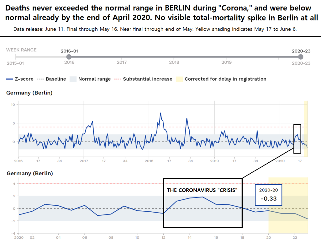
See below for a brief explanation of what these lines mean.
There never really was any “Corona” event at all in Berlin observable in all-cause mortality. It was so mild as to be negligible, totally forgettable. The disconnect between this reality and the intense media coverage is puzzling, and a core subject of study withinin Corona Panic Studies.
What’s going on? Is something unusual about Berlin? Let’s see. I invite you to stay along for the long haul here and see for yourself.
_______________
This post will include a look at each of the 24 countries for which data is available in the EuroMOMO database. It includes the following sections:
Organization of this Post
- Introduction and summary of the scope of the investigation;
- Brief remarks on the dataset and how to read the graphs;
- Summary of findings of the full investigation (TLDR);
- A closer analysis of the seemingly curious case of Berlin by way of introduction;
- The Berlin case complete, I make some general remarks on the state of “Corona Panic Studies;”
- I then examine the other twenty-three countries in the dataset each in turn, in four groups from mildest to most affected (Group 1: Berlin, Estonia, Denmark, Greece, Hungary, Norway; Group 2: Austria, Finland, Hesse (Germany), and Malta; Group 3: France, Ireland, Luxembourg, Portugal: Group 4: Belgium, Italy, Netherlands, Spain, Sweden, Switzerland, and the UK (England, Wales, Scotland, Northern Ireland);
- Then, in the penultimate section, I summarize the magnitudes of Wuhan-Coronavirus vs. the magnitudes of winter flu in the 2010s in the reviewed countries that showed any excess;
- Lastly, I conclude with some final thoughts on the Corona-Panic three months after the Panic pushed country after country into lockdown.
I posted some of the total mortality numbers for European countries in Part III (“Just the Flu Vindicated”) two months ago, when the coronavirus excess-mortality spikes were either still rising or when the data, not yet finalized, was still ambiguous. By now, mid-June, the Coronavirus wave has receded everywhere — though as the case of Berlin shows, in some cases there really was no wave at all.
We can now look at the full magnitude of the period’s total-mortality excesses and what they tell us about this flu epidemic and how it stacks up against others. If you want an ultra-slim, glib summary: It really was “Just the Flu.” You may not like that phrase, but look at the data yourself.
__________________
Introduction and Summary of Scope/Findings of this Post
- The Basic Research Question. “Did countries show an alarming excess in total deaths during the ‘Corona’ period of March to May 2020?“
- The Answer: Alarming excess? No. Nowhere. Any excess? Some places. In a review of twenty-four countries in Europe, we see no mortality-excess outside the normal range in six countries; mild excess in eleven countries; and significant spikes in seven countries. In only two or three (of the latter seven) will the full magnitude of the mortality-excess double that of their own late-2010s flu spikes, with the impact softer on a longer time horizon (see the final summary section for list of countries by how much the Corona-associated excess compares to their own 2010s flu spike excesses).
- Of those countries with mortality excesses, many have entered below-average mortality following the end of their spikes. I expect this will continue and will be seen in every country that showed a spike, given the age-condition profiles of those whp died in this flu wave (over 80 and in poor health). I will update this post July 2 and would expect to see countries that had significant excess-mortality (especially Sweden) to show below-average mortality for June.
- Q. “Aren’t the countries with the largest spikes worth the most attention? The mildly affected countries would’ve ended up more like the largest-spike countries without the draconian lockdowns, right?” A. Maybe, but local conditions are always important, and the factors of the Panic and the lockdown itself distort the numbers in some cases, definitely inducing many excess deaths in some places (most notably, England).
- What we can do is compare the 2020 spikes, where they exist, with previous flu spikes in the recent past in the same countries (apples to apples).
- Mortality excesses associated with flu waves are visualizeable as ‘spikes’ (if looking at a long timeline): Rising, peaking, and falling over a several-week period (the Deaths curve of a given flu epidemic). The question to ask is: In cases where we see a spike in March to May 2020, the 2020 mortality spikes are all on the order of observed peak flu waves of the late 2010s, which is surprising given the media coverage and the extreme Panic.
That is therefore the scope of the investigation here. Was there a total-mortality spike during the ‘Corona’ period in 2020? If so, how does it compare to the same place’s own recent flu spikes?
________________
The full-post here is 11,000 words; internal links allow you to jump around.
________________
The Dataset
The European Mortality Monitoring Project (EuroMOMO) provides us a good opportunity to analyze total-mortality data for several countries that employed several different “pandemic strategies.” EuroMOMO is a project that began in 2010 and collects its data from the relevant health agencies.
The beautiful thing about this dataset is the scope/consistency of the data (all-cause mortality), unbroken back to Jan. 2015 for most countries. Even more useful would be something back to, say, 1995 or 1985, but 2015 will do.
The database was revamped sometime about late April or early May, with a new look and a sliding bar to zoom in on different periods, which is why the images used in Part III look different.
As to how to read the graphs. I’ll use the case of Berlin again to orient the reader:

The heavy blue line representing deaths.
The grey numbers at the bottom are year (four-digits) or week of the year (two-digits).
The baseline is the lower dotted line. It represents the theoretical normal level of deaths calculated by EuroMOMO based on the long-run average in the dataset. It is labelled “0” on the y-axis, meaning deaths at that level are at zero z-score excess or deficit. It sits at the center of a blue band (-2 to 2 on the left-hand axis), the “normal range.” This is set by EuroMOMO based on the numbers in their database.
The next threshold to be aware of the (arbitrarily set) “Substantial Increase” threshold, at 4. During peak-flu-events, deaths in a given week will tend to exceed this.
Excess deaths, what we are interested in, are represented abstractly by z-scores in the database, theoretically allowing comparison between countries in a standarized way. Visually, the area underneath a spike down to the baseline is the excess mortality for that period. For a long time series with several spikes, you can visually, at a glance compare magnitudes.
With no further words needed, a casual glance at that mortality graph for 2016-2020 in Berlin, then, absent intense propaganda during/about the period I put in a black box, would lead no man (or woman, child, animal, or other sentient being) to particularly notice the period March to May 2020 as anything unusual.
___________________
A summary in brief of findings of the full investigation
- Most countries in the EuroMOMO dataset show only a modest rise in total mortality. I group countries into four categories here based on the way their datasets look, from mildest to worst:
Group One. Countries that never exceeded the normal range for deaths (something peak-flu-events achieves almost every year). There are six. They are: Berlin, Denmark, Estonia, Greece, Hungary, Norway.
Group Two. Countries that did break out of the normal range but never exceed the Substantial Increase range. Four countries are here: Austria, Finland, Hesse (Germany), Malta.
Group Three. Countries that briefly exceed the Substantial Increase range (no more than three weeks). There four countries here: France, Ireland, Luxembourg, Portugal.
Group Four. Those that exceed the Substantial Increase threshold four at least four weeks. There are ten countries here, of which four are the constituent countries of the UK (England, Wales, Scotland, Northern Ireland) and the others are Belgium, Italy, Netherlands, Spain, Sweden, Switzerland.
While ten qualify on these technical grounds for Group Four, several were lightly affected, with excess-mortality either less than their own observed flu spike periods in the late 2010s or <1.5x as high. This leaves only Belgium, Italy, England (and next-door Wales, really an extension of England for these purposes), and Sweden as the countries on which the Coronavirus wave had a high impact. No-Lockdown Sweden happens to be the lightest-affected of this group, with the mildest spike in absolute terms.
- Pre-Corona Mortality Deficit: Comparing the worst-hit countries with the periods immediately preceding the Corona spike, we always see death-deficits before the Corona spike; the virus takes those closest to death anyway (as all flu virus waves do, every year to some extent), and there had been a mild year or two leading up to the Wuhan-Corona event.
- Post-Corona Mortality Deficit: In almost all countries, we observe mortality deficit in effect by May, and early indications are that it is continuing (will continue) in June. This is the “culling effect” in practice: Those closest to death, who otherwise would’ve died at a steady rate over a few weeks/months, “bunch up” with the virus. This happens with every winter flu-event.
- Dating the end of the Epidemic: The most common week for total deaths fall back to the normal range or in some cases below the baseline (into expected-mortality deficit) is Week 18 (April 26 to May 2), indicating the epidemic was already “over” by no later than mid-April, more likely early April, given that deaths are a lagging indicator and will occur some weeks after infection, deaths fading back to the normal range by Week 18 indicates the transmission phase was running out of steam already by Week 15 (March 29 to April 4). This is as the anti-Panic side argued, and exactly as Knut Wittkowski showed in his paper (first version published March 31) and his major interview (record April 1-2, released April 3). Wittkowski is vindicated. (See Part V: A Hero of the Hour). Cool-headed epidemiological expertise was right; the extremists living out an apocalypse fantasy were wrong.
- In Sweden’s case, it appears that May 23 is the exact turning point, the day mortality fell back to normal territory after two months of some degree of excess. Three-quarters of the deaths in Sweden were reportedly to those “either in nursing homes or receiving at-home care,” an unusually high number for a flu wave.
- “Stay-Open Sweden” is probably of most interest of the countries in the EuroMOMO database, given that it stayed open. It is in Group 4 and stands among the countries in which mortality exceeded the Substantial Increase range for at least four weeks. The most important lesson on Sweden from this study are: In Sweden (no lockdown), excess mortality measured by z-scores is lower than excess mortality in several of the lockdown countries (Spain, Belgium, and England), suggesting that the lockdowns did little or nothing in many places.
- There is an imminent death-deficit coming for Sweden, in which total-mortality is below baseline for a while, probably starting in mid-June (Week 25) (I will check this prediction with the July 2 update to see if I am right). Full-year mortality will end up within the normal year-to-year fluctuation range usual range (this is discussed in the Sweden section).
- It has come out that quite a few countries’ political leaders overruled their own health experts, who advised a Swedish-style approach of staying open and taking basic precautions as in any peak flu period.
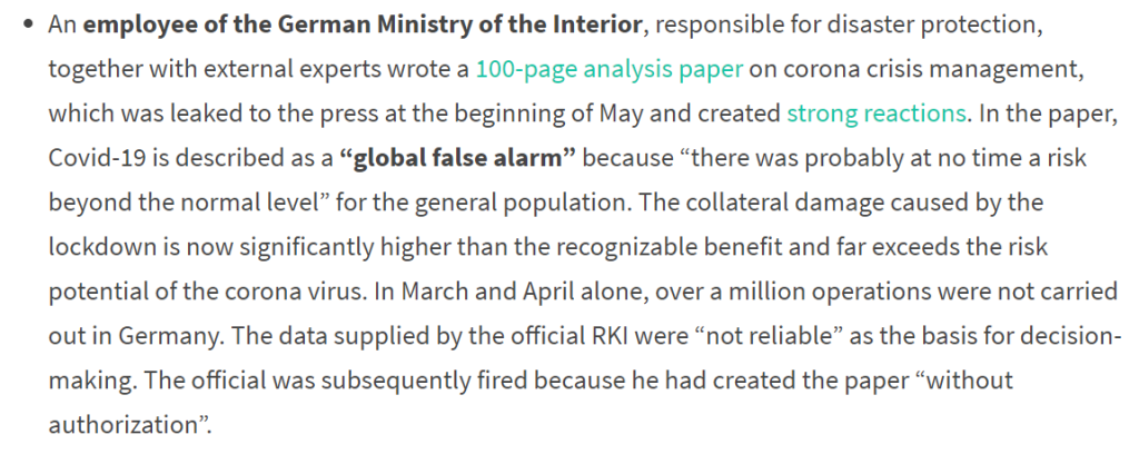
- Several national leaders are now expressing regret that they pulled the ‘lockdown’ trigger in March at all (this is true in Denmark). These public regrets are tacit admissions that the lockdowns were a public policy disaster in which they effectively sabotaged their own economies and populations, creating economic and social turmoil (certainly inducing the rioting and bizarre political activity of late May into June), all in response to what ended up being a phantom crisis. As one phrase out of the German government had it, a “Global False Alarm“:
- We know there have been lockdown-induced excess deaths, most notably in England; in other words, the excess-mortality spike in England spike would probably have been significantly lower without the Lockdown, more in line with that of other countries.
- What was, in the end, the final “hit” from this virus? Adding up z-score excesses in countries that had 2020 spikes and comparing them to z-score excesses during previous flu spikes in the late 2010s in the same countries (apples to apples) for countries that showed mortality spikes sometimes in March to May 2020, we see that Wuhan-Coronavirus may be around 1.3x as lethal as other breakthrough flu strains active in the 2010s, (See also Closing Summary for a one-place list of countries than relative lethalities on this measure).
- If it is true that the virus was no worse than 1.5x as bad as the peak flu wave of the late 2010s, and given that the 2010s inspired no panic or lockdowns over flu, we are left with the picture of an unnecessary Panic.
- In June, the perception that Corona was a major crisis remains, but the data now settles the question. It was not.
________________
- BERLIN
Back to the case of Berlin.
The graph is self-explanatory, but a few comments are in order. Here is the graph again:

Comments and things to be aware of:
(1) A very mild season before Corona. Berlin was running a mortality-deficit in the 2019-20 season before Week 13 (late March).
You can see that most weeks are below the baseline dotted line. There were no spikes at all in the 2019-20 winter season, even mild ones. Going back to the previous winter season, there was one mild little bump in early 2019, but that may have been the weakest flu-wave visible in total-mortality in the whole of the late 2010s in Berlin.
As a general rule, this holds true to some extent in all the places in this study. The 2019-20 flu seasons before Corona had been one of the mildest in years. Some countries show two full years of no period of any sustained excess mortality (no spikes), meaning lots among the weakest and frailest (marginals) had survived, but died when bad flu activity began; had the previous two years not been so mild, many of these would have died earlier.
In Corona Panic Studies, this bit of context ought to not be neglected. I have never seen it mentioned in any media coverage, naturally. It alone accounts for a portion of these deaths. Quantitatively, a certain share of the population is always near death. Say it is 1%. A certain portion will die in a ‘baseline’ year. Say 30% of the 1% will die in a baseline year. A slightly higher portion will die in a year with a peak-flu-event/spike. Say, 32% of the 1%. This simple movement, +2% deaths among the weakest/frailest 1%, covers the great bulk of Corona deaths. (See also Point 3 on what this means for the coming weeks/months).
(2) Mortality Deficit vs. Coronavirus-associated spike in Berlin: Measuring the magnitudes in z-scores. I calculate that for the most recent forty weeks through mid-May 2020 (from [2019 Week 32] to [2020 Week 20]), total-mortality for Berlin was below average (in deficit).
[2019 Week 32] to [2020 Week 12] show an aggregate -12 z-score deficit (meaning fewer deaths than expected by the baseline).
The “Corona Crisis” period, Week 13 to Week 17 in 2020 for Berlin amounts to an aggregate of only +6 z-score excess, before fading back into deficit thereafter (see point 3).
The small coronavirus-associated bump therefore only made up for half the long-run recent recent deficit.
Yes, between mid-2019 and mid-2020 including ‘Corona,’ Berlin stands at below-average total-mortality including all of its coronavirus-associated bump. It appears that the same holds for all of Germany.
This method of calculating deficit and excess mortality, using z-scores, will be returned to for Group 4, when the excesses are significant.
(3) The post-Corona drop in deaths (We told you so): Below-average mortality already a fact by late April and into May. After the very modest rise in total mortality, peaking Week 13 to Week 15 (March 22 to April 11), we already observe a “culling effect.” At least some of this is that those closest to death, who were likely to imminently die anyway, died with the Corona wave in late March/April, and were thus were unavailable to die in May/June. This pushed down total-mortality in those periods, exactly as expected.
Mortality was below the baseline (“in deficit”) already as of Week 18 (late April) in Berlin. It remained below the baseline throughout May, with early indications suggesting that deficit still holds into early June.
This will be another theme of this study; mortality deficit holds in country after country. For those where it does not hold, a return to the data in a few weeks time is very likely to show it.
(4) Most importantly of all is Context, historical perspective. How does ‘Corona’ compare with peak-flu-period spikes even of the very recent period?
For Berlin, we see that the Wuhan-Coronavirus-associated rise is merely the fifth-largest mortality spike in the last five years. It was very much “Just the Flu” in that sense, even a mild flu wave. Corona 2020 was much less than the 2016-17 flu-spike and lower than another that peaked in late-winter 2018.
Measuring it quantitatively, the the 2020 Coronavirus-associated all-cause mortality bump is +6 z-scores. A winter spike in Berlin in early 2018 amounted to +44 z-scores of excess (2018 Week 5 to Week 15), towering over Corona.
This is a very important point and will be a theme throughout this study:
The coronavirus-associated mortality excess in 2020 is only 0.14x the level of the peak flu season of the late-2010s in Berlin. For every 100 excess deaths associated with the 2018 flu wave, the Wuhan-Corona wave took only 14. (Note that Hesse, a large region in Germany not near Berlin, showed the same, at 0.1x.)
(See the final section for a summary of the magnitudes of all-cause-mortality excesses in all the reviewed countries compared to their own mortality-excesses in a late-2010s flu spike, and how Berlin’s very-low 0.14x compares.)
________________
Question: Why was this one virus, marketed so aggressively as a stop-everything apocalypse virus and which triggered such panic in Germany, so mild in Berlin, a major metropolis?
The answer the anti-Panic side has been arguing for three months: Wuhan-Corona never was an apocalypse virus or even close, and definitely did not merit the Panic.
Critics might say Berlin is not representative. See how Berlin compares to other places in Europe in the final summary section.
In fact, Berlin is representative of about half the countries measured in the EuroMOMO database (Groups 1 and 2 below); other countries are higher. We only see anything approaching a significant mortality spike in the countries of Group 4 here. All of these will be examined individually, below.
Before proceeding, a brief step back on where Corona Panic Studies stands as of mid-June 2020.
_______________
The Corona-Panic Remains
The recent protests/riots, and the associated bizarre moral-panic (See Part XIII), were something of a two-week-long distraction.
As of this writing (June 11-12), there are signs that the forces of the Corona-Panic proper are regrouping. Events are still being cancelled, lives disrupted, and they will be for a long while to come. Real damage has been done that dwarfs the cases of looting and rioting in certain cities. The media, which silenced its Corona drumbeating for a time to engage in and lead the latest moral panic (one within the wider virus moral panic and causally related thereto), is getting the drums back out of storage.
My goal has always been to look closely at the evidence. I noticed, starting in March, how scandalously little attention was being paid to evidence/data in “mainstream discourse” on Corona. Groupthink set in (and Corona became a religion, as I argued in Part XII).
Looking Back on almost Four+ Months of a Media Campaign to Promote Fear of ‘Corona’
The website Swiss Propaganda Research has released a major June update, thousands of words’ worth, in which it notes again the degree of lockstep and drumbeat-style propaganda that characterized the response to this flu virus and no other in history (it looks like the Wuhan-Coronavirus Response even exceeds the response to the 1918-19 pandemic). Here is what they say:
A lot of people are shocked by the dubious and often fear-mongering Covid19 reporting of many media outlets. Obviously, this is not “ordinary reporting”, but classical and massive propaganda, as it is typically employed in connection with wars of aggression or alleged terrorism. […]
If, for example, pictures of soldiers in protective suits disinfecting entire streets are seen on television, this does not prove the danger of the corona virus, but rather – as Professor Giesecke put it benevolently – proves useless “political activism”. Or as others would put it: propaganda.
The puzzle of why there was such an intense propaganda campaign about something so mild is a question beyond the scope here but which I hope to return to in another post.
As for media propaganda, analyzing it, the ‘What,’ is easier than answering the ‘Why.’ In March, we of the anti-Panic side began saying, “Don’t trust the numbers in the media about deaths,” partly because they were contextless. What does it mean that 100,000 people died while positive or presumed positive for a certain virus, in three months? Does that mean anything in particular? There is flatly no way to know, without context, without more information; but the media that drumbeats such numbers will con the majority. All it takes is Big Scary Numbers, a few scary pictures of videos, and Drumbeating.
But we were not mere naysayers. We of the anti-Panic side said, “Look at the total-mortality data.” In theory it would give us a good handle on the “deaths-with vs. deaths-from” problem, for one thing. I said as much in Part III here, written two months ago.
The peak has now long been passed everywhere. In the vital area of all-cause total mortality tracking, there is a delay before you can say you have firm and final data. It differs by country, but all have some degree of reporting delay. EuroMOMO’s weekly update, midday June 11, provides full/final data for the entirety of the epidemic arc (the rise, peak, and fall back to the normal range of the Deaths curve) in every country.
The Corona Riots
I spent much time observing, at close range, the Corona-Lockdown-induced anti-police and anti-white-racism protests in late May and early June. In the process I ended up injured and with a bit of a black eye, but have now fully recovered.


Much more deserves to be said about these “protests,” but this post threatens to be long enough already. A brief point ought to be made: If the regime supports a protest, it’s not a protest.
I would again point to the relationship the “protests” have with the Corona-Panic which dominated everything for almost three months before the “protest” cycle began, seemingly out of nowhere but obviously Lockdown-induced. Yes, the reason a Red-Guard-style Maoist-race-cult was able to break into the mainstream was obviously Corona-Response, the recklessly disruptive Lockdown. I posted to this effect back on June 2 at the height of it.

I am surprised the Corona Lockdown connection with the “protests” has not been widely noted. Anti-Panic journalist Peter Hitchens does it in an excellent June 14 column (“As the Left now controls every lever of power, we face nothing less than Regime Change“).
In the long run, the relationship between ‘Corona’ and the “protests” may be obvious and taken for granted.
Just as the fish in its fishbowl does not notice it is in a fishbowl at all, it’s hard (for most) to notice a moral panic while in it, but impossible to miss when looking at it from afar. This applies to both Corona generally and to the anti-police/anti-white-racism “protests.”
And to swing back to the matter at hand: All-cause mortality numbers for a long time horizon including the entirety of the Corona spike, by this point, are a glance at the fishbowl from across the room.
Reconstructing what went wrong in the West in 2020 must strike the root, must identify the Corona-Panic escalation cycle. We are now able to make firm conclusions from final/observed data, so let’s do it.
Having given a close look at Berlin above, and summarized the findings for the entire study, I’ll now proceed with the country-by-country graphs/reviews. They are grouped into four categories, from those that showed no impact on total mortality at all (Group 1), to those that showed distinct spikes (Group 4).
_________________
Group 1. Countries that never exceeded the normal mortality range during ‘Corona’
These are: Berlin, Estonia, Denmark, Greece, Hungary, Norway.
- BERLIN, GERMANY (See above);
__________________
- ESTONIA
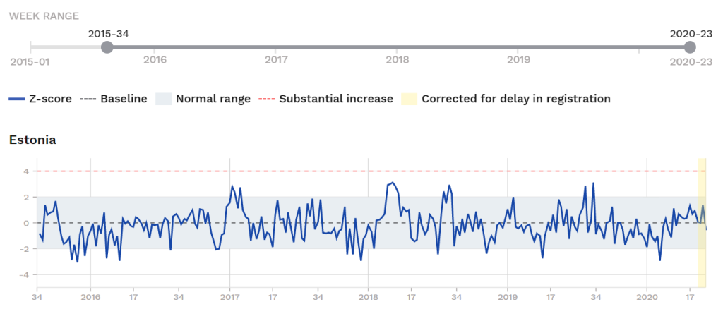
In Estonia we see no real evidence from total mortality data of anything going on at all. Mortality hovers in normal range throughout the ‘Corona’ period.
If there was any Coronavirus-associated excess mortality in Estonia between March and May, it was so mild as to be hidden by several other fluctuations in past five years.
Coronavirus-positive deaths in Estonia so far: 69, almost all in April. (Only two in June so far, as of June 12.) Based on 2019 total-mortality data, Denmark should have had approximately 3,850 all-cause deaths in the three-month peak-Corona period (March to May).
Estonia had a draconian lockdown imposed in mid-March. They may be subject to a second wave, which means they will either lock down a second time (unlikely) or adopt a Swedish style response.
(See the final section for a summary of the magnitudes of all-cause-mortality excesses in all the reviewed countries against their own late-2010s flu spike magnitudes. Note that Estonia is now listed because it showed no excess at all.)
__________________
- DENMARK
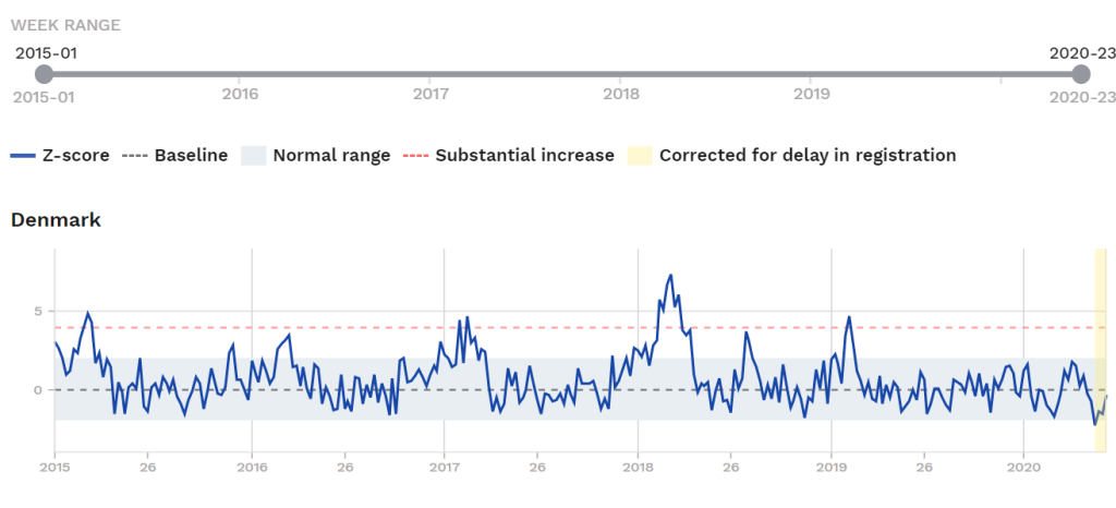
Total mortality in Denmark also never exceeded normal range. The small bump you see there associated with the Wuhan-Corona wave is much smaller than previous yearly flu spikes, and you can see it is both preceded and followed by a below-average mortality period. Interestingly, Denmark shows a net mortality-deficit for the two-month period April and May (Week 15 to 22), which includes some of peak ‘Corona.’
Total Corona-positive Deaths in Denmark vs. Total Deaths
As of this writing, 580 people had died in Denmark while Wuhan-coronavirus-positive. Based on 2019 total-mortality data, Denmark should have had approximately 15,300 all-cause deaths in the three-month peak-Corona period (March to May), making this 580 Corona-deaths (including deaths with and deaths from) not very significant.
The minor bump in all-cause mortality in the coronavirus period in 2020 netted Denmark a modest +6.5 z-scores of excess deaths. This is that small period between two deficit period in the graph, forming a little triangle. (The immediately preceding deficit period [Weeks 7 to 11] alone was -5 z-scores below the baseline; there really is no story here.)
The peak-flu-event spike we see in winter 2017-18 (weeks 51 to 15) amounted to +65 z-scores of excess, or several thousand excess deaths for that period, but of course no shutdowns were imposed.
The coronavirus-period-associated mortality excess in Denmark was 0.1x the same in a flu event in the 2017-18 season. (For every 100 excess deaths in that peak-flu-event, 10 died in the 2020 coronavirus event.)
(See the final section for a summary of the magnitudes of all-cause-mortality excesses in all the reviewed countries compared to their own mortality-excesses in a late-2010s flu spike, and how Denmark’s 0.1x compares.)
The pro-Panic, pro-Lockdown Danish Prime Minister pverruled her own Health Authorities
Denmark imposed a series of kneejerk shutdowns beginning March 13. These measures were later regretted by Danish leaders, first by public health experts and finally by the Prime Minister herself (to her credit for taking ownership of the mistake).
In late May, it came out that Danish health authorities, in February and March, had recommended a relaxed, no-shutdown, Swedish-style approach to the virus and recommended ignoring the media hype as counter-productive. These experts’ advice and recommendations were “steam-rollered” by the Prime Minister Mette Frederiksen (b.1977; Social Democrat) who panicked based on media coverage. She demanded the lockdown, and got it.
Needless to say, the smoke has long since cleared now, and it is clear the economic hit and negative health consequences are certain to be much worse (but on the “slow burn”) than the mild impact of this one flu virus.
This anecdote of Prime Minister Frederiksen telling her own public health experts to shut up and sit in the corner while she commandeered an unprecedented lockdown is a good little encaspulation of the whole Corona narrative: “Keep the experts quiet; the Holy Media is in charge here, and politicians are at the ready to carry out their will.”
__________________
- GREECE
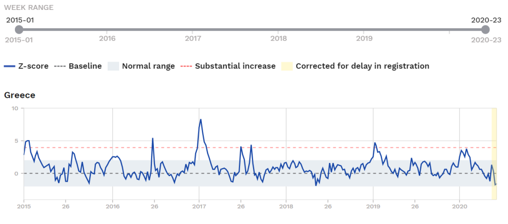
Greece is another case in which deaths never exceeded normal range at all. They were already below baseline mortality as of Week 16 (!) (April 12 to 18) and this held for four weeks. Never during even the height of their Corona-positive death period (late March to early April) did total all-cause deaths come close to exceeding the normal range.
We see Greece had several distinct flu-spikes in recent years, the biggest one visible in Dec. 2016 to Jan. 2017. There was another in the first weeks of 2020, pre-Corona (Greece was above the normal range from Week 1 to 7). ‘Corona’ did not come close to any of these and during the relevant period it hugged the baseline and even went below-average.
(See the final section for a summary of the magnitudes of all-cause-mortality excesses in all the reviewed countries compared to their own mortality-excesses in a late-2010s flu spike, though as Greece shows no countable excess at all in the relevant period, it is not listed.)
Why did Greece impose a lockdown?
Greece imposed a pretty strict lockdown on March 23, following the lead of the key NATO-bloc countries before it. (Note that No-Shutdown Sweden is not in NATO.)
Despite the early-2010s-era acrimony between Greece and the EU, Greece depends on the good will of Western Europe and the US for its security and probably felt it was impossible to “pull a Belarus” (ignore Corona; mock the panickers), and also felt it didn’t have the cachet or courage to “pull a Sweden” (hold tight to an evidence-based approach against international-media pressure).
Total Corona-positive deaths reported in Greece so far: 183. Total expected deaths for the period March to May (based on 2019 mortality): 21,500.
__________________
- HUNGARY
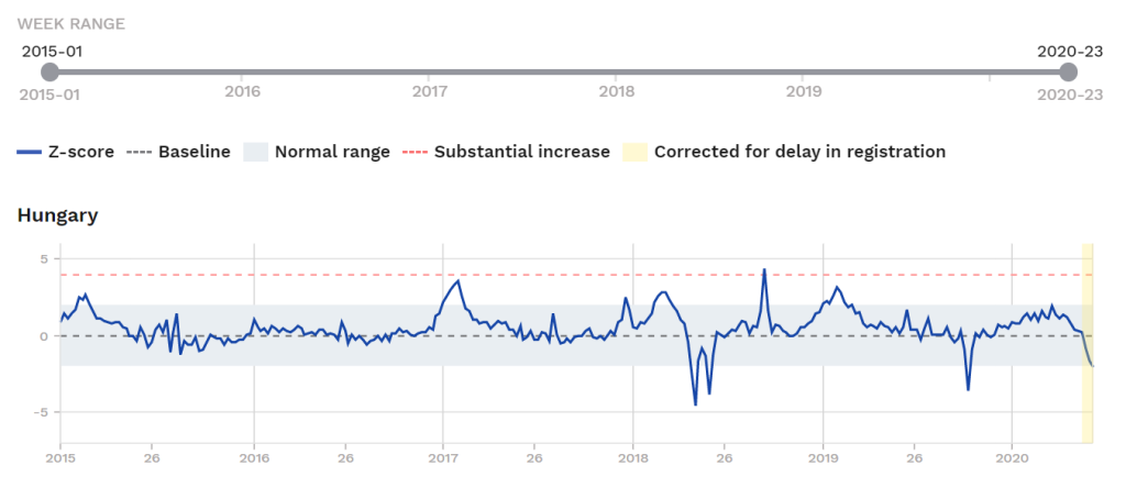
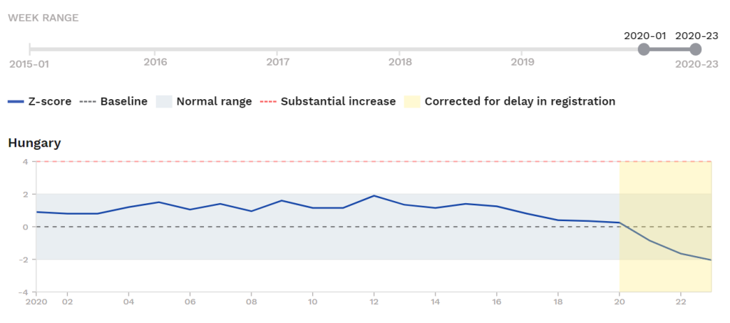
In Hungary we see simply no sign of any mortality excess of any note so far in 2020. There is not even any even mild rise in the Wuhan-Corona period above what was going on in the weeks and months of winter 2019-20 before Wuhan-Corona.
It looks like the small number of coronavirus-positive deaths in Hungary probably put slight upward pressure on deaths from mid-April and into early May (in terms of the graph, Week 15 to Week 20). This may have been enough to keep deaths above the baseline, but we see early data indicating sustained below-baseline mortality for Weeks 21 to 23 (late May and early June).
The Week 15 to Week 20 period in Hungary shows +4.5 z-scores of excess mortality (always in the normal range), while Week 21 to Week 23 in preliminary data show a mortality deficit of -4.5 z-scores; the very mild excess in the Wuhan-Corona period may have already been entirely cancelled out by mid-June.
(See the final section for a summary of the magnitudes of all-cause-mortality excesses in the reviewed countries, compared to their own mortality-excesses in a late-2010s flu spike; Hungary, which shows no discernible excess, is not listed.)
Total Corona-positive deaths reported in Hungary so far: 562. Total expected deaths for the period March to May (based on 2019 mortality): 32,500.
Hungary Panicked and Locked Down in March
Hungary panicked and lockdown down relatively early, already taking kneejerk measures to this effect beginning March 13 (a total ban on all foreigners in effect from March 16), and the parliament granting the government quasi-dictatorial powers on March 30, as the international panic cycle continued.
Does Hungary regret its lockdown? It certainly dealt a serious blow to its own economy. What would its epidemic have looked like without a lockdown and taking a Swedish-style response? The answer can be guessed at by looking at the same dataset for Sweden, which is below. As of this writing in mid-June, the epidemic in Sweden is already over in terms of any excess mortality period, but the virus was never able to pass through the Hungarian population, almost guaranteeing a second wave.
__________________
- NORWAY
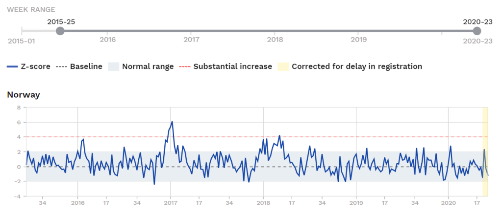
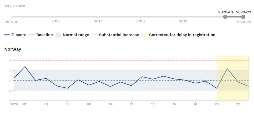
Norway is another country that never exceeded normal-mortality range during Corona. It did do a fairly draconian lockdown and will take a GDP hit for it, with long-run worse health outcomes for many, who will get no media coverage,
The year 2020 through Week 20 appears to possibly be a year-to-date mortality deficit. Not-yet-finalized data suggests Week 21 may have finally exceeded the normal range, but barely.
Corona-positive deaths: 239, with <5 in June so far. Total expected deaths for the period March to May (based on 2019 mortality): 10,200.
(See the final section for a summary of the magnitudes of all-cause-mortality excesses in all the reviewed countries compared to their own mortality-excesses in a late-2010s flu spike, though as Greece shows no countable excess at all in the relevant period, it is not listed.)
Norway’s lockdown is now regretted by the Prime Minister who admits she panicked in March, rules out future corona-lockdowns
Noway imposed a lockdown in mid-March but it was soon regretted. By late May, the Norwegian Prime Minister publicly admitted the lockdown was a bad move and said there will not be any future lockdowns, but a Swedish-style response:
The Prime Minister of Norway publicly admitted that she panicked in March and that most of the lockdown measures would probably not have been necessary. In Norway, too, it became known that the reproduction number already fell to the stable value of 1 before the lockdown. In the case of a “second wave”, a much softer strategy without lockdown would have to be chosen, the Prime Minister declared.
(from “Coronavirus: Norway wonders if it should have been more like Sweden: Cost of lockdown sees prime minister raise questions about strategy,” by Richard Orange, May 30, Telegraph [UK])
This is all exactly as the anti-Panic side argued all along, of course.
Just like the Danish Prime Minister (see above), the Norwegian Prime Minister herself panicked in response to media coverage which resulted in the government imposing its unnecessary, now-regretted lockdown.
The Norwegian Prime Minister is Erna Solberg (b.1961; m.1996; two children). She has been a member of Norway’s national legislature since 1989; leader of Norway’s main conservative party since 2004; Prime Minister since 2013.
________________
Review of Group 1:
That takes care of the six most lightly impacted places in the EuroMOMO database during March to May 2020: Berlin, Estonia, Denmark, Greece, Hungary, and Norway.
In these six places we see no real trace whatsoever of anything unusual in total (all-cause) mortality during ‘Corona.’
All imposed lockdowns and hurt their own economies, and the virus may return to each of these places, which is not the case for Stay-Open Sweden (Group 4) which has by this writing achieved herd immunity in most places.
The next category: Countries also lightly affected, in which we do see some minor rise in all-cause mortality but never exceeding the “Substantial Increase” threshold (the upper dotted line in these graphs). The countries in Group 2, like those just reviewed in Group 1, are mainly in the broader Germanic sphere, plus one island-fortress (Malta) which locked down and crippled its own economy.
__________________
Group 2. Countries that never exceeded the Substantial Increase range but did go above-normal mortality
These are: Austria, Finland, Hesse (Germany), and Malta.
__________________
- AUSTRIA
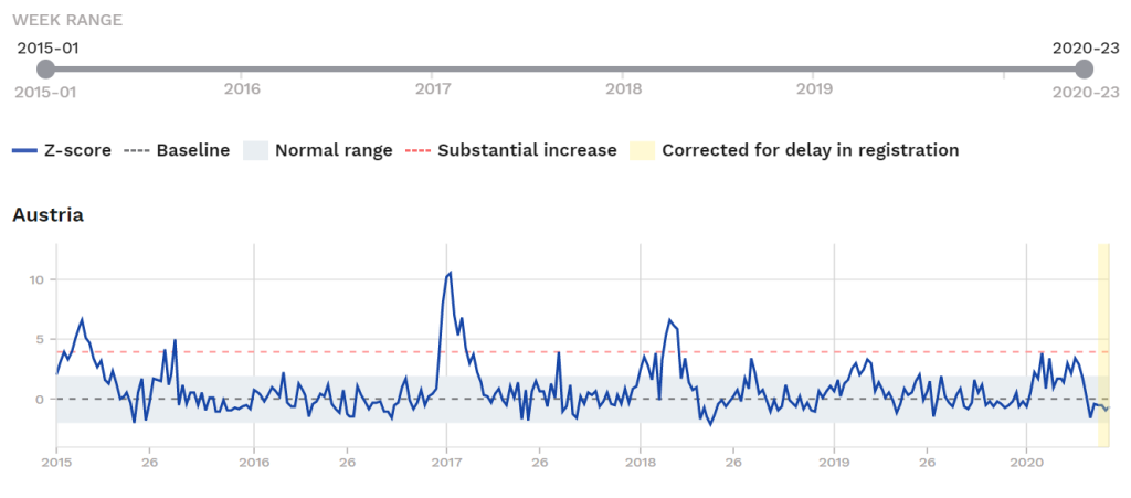
In the case of Austria we see a slight bump during Corona but it is not really visible because an elevated mortality period predates it earlier in the year, not to mention the much bigger spikes most other years:
Here is the zoom-in on 2020:
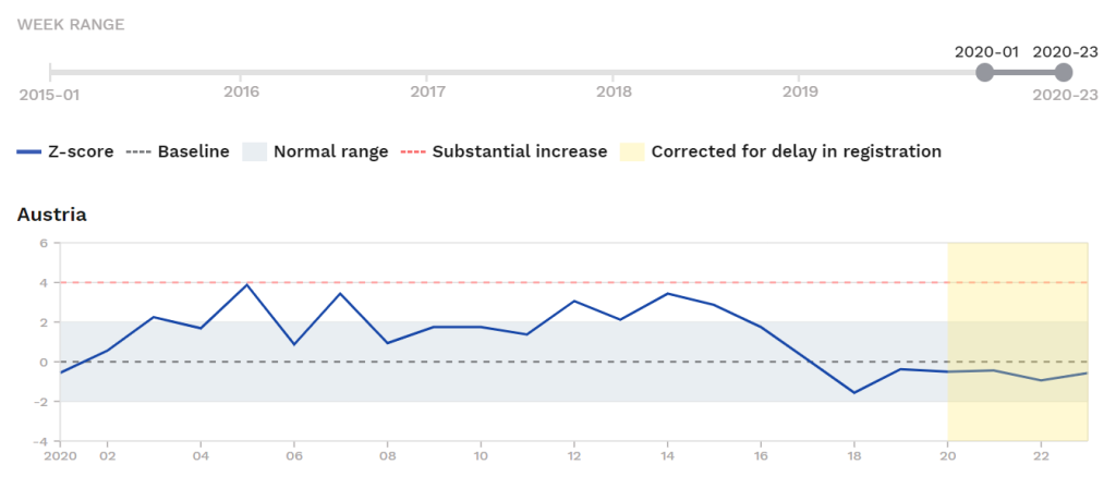
Mortality is slightly above the normal range as of Weeks 5 to 7 (Jan. 26 to Feb. 15). When ‘Corona’ begins about Week 13, we see another slightly elevated mortality period but which does not exceed the earlier winter bump. And both these bumps are much weaker than the winter flu spikes seen each year, 2015, 2017, and 2018, and about equal to the early-2019 bump (see first graph). There is therefore “nothing to write home about” here.
Total corona-positive deaths in Austria: 677. Total expected deaths for the period March to May (based on 2019 mortality): 20,600.
Austrian Chancellor overruled own health experts to force through Lockdown
Austria imposed a lockdown, preceding Germany’s but basically running parallel to it and to other NATO-bloc countries in the steps taken, e.g. Austria also imposed mandatory mask-wearing laws in early April, about the time New York City did the same.
Chancellor Sebastian Kurz (b.1986), who came to power as a supposed right-wing populist in late 2017 (the kind of politician media coverage would suggest would be against Lockdown, as was Brazil’s president for one example) also appears to have panicked personally, and/or been unable to contain the pro-Panic elements of his government, and again as in the case of Denmark (see above), overruled his own government’s health experts to force through the Lockdowns:
Leaked protocols in Austria […] have shown that the lockdown was politically motivated and the majority of the health experts spoke out against it, recommending to Chancellor Kurz in March to get away from the message of a “very dangerous virus” because the virus was already widespread and not particularly dangerous for the majority of the population.
Magnitude of excess all-cause mortality in Austria during the Corona period
The mild bump in Austria in the relevant period amounts to +10 z-scores of excess deaths (Weeks 12 to 16).
This is far under Austria’s own 2016-17 flu spike which came in at +66 z-scores of excess deaths (2016 Week 51 to 2017 Week 10).
The 2010 coronavirus-associated mild excess in Austria is only 0.15x the level of a recent, 2010s-era flu spike. For every 100 excess deaths in its 2016-17 flu spike, there were 15 in 2020.
(See the final section for a summary of the magnitude of all-cause-total-mortality excesses in all the reviewed countries against their own late-2010s flu spikes, and how Austria’s 0.15x compares.)
__________________
- HESSE, GERMANY
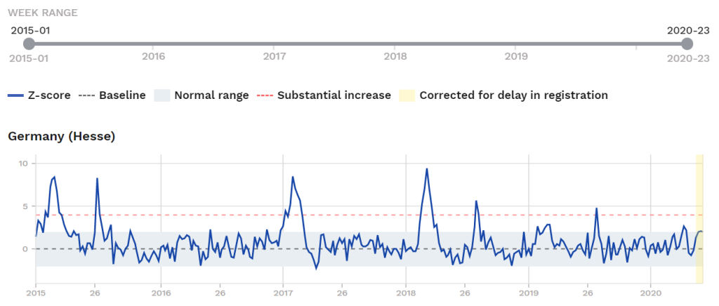
The state of Hessen (or Hesse) in Germany (pop.: 6.3 million) had no real Corona spike noticeable when compared to previous years winter flu-spikes, and barely qualifies for this category. It was above the normal range for only two weeks, Weeks 15 and 16 (April 5 to 18), and had already fallen below the baseline (into below-average mortality) by ca. April 20, where it held until ca. May 5.
Hesse has had 484 corona-positive deaths, with only four in June as of June 14. Total expected deaths for the period March to May (based on 2019 mortality): 17,750.
We see the small spike during the Corona period in Hesse, amounting to a mere +7 z-scores of excess (2020 Week 13 to 16).
A glance at the graph shows that Hesse had three distinct winter flu spikes. in the 2014-15, 2016-17, and 2017-18 seasons. The latter two amounted to about +50 z-scores each of excess mortality each.
The Corona-2020 period, such as it was, therefore amounted to only ca. 0.1x the magnitude of excess deaths of several flu spikes in just the past five years.
(See the final section for a summary of the magnitudes of all-cause-mortality excesses in all the reviewed countries compared to their own mortality-excesses in a late-2010s flu spike, and how Hesse’s very-low 0.1x compares.)
__________________
- FINLAND
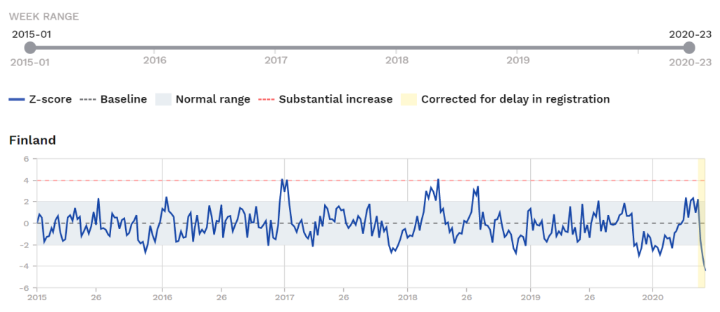
Finland had a very modest period elevated deaths Week 15 to Week 20 and like Hesse barely qualifies for this category. The aggregate for its Corona period hugs the top line of normal range. It’s corona spike is not visibly higher than several previous winter flu spikes in the late 2010s, and even a mid-year spike in 2018.
Here is the zoom-in on 2020 only:
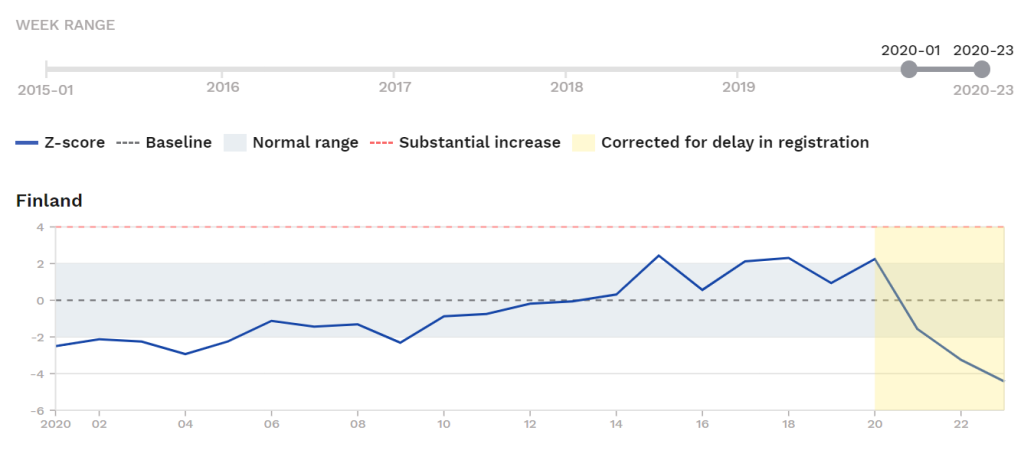
The period in yellow is too soon to make firm judgments on because countries always have some degree of reporting delay, but early indication is that Finland is in below-normal mortality by Week 21 (starts May 17), and possibly sustained below-normal mortality holding for Week 22 (starts May 24) and beyond, possibly “canceling out” all the corona-associated excess already by June.
Finland has had 325 corona-positive deaths, with only five in June as of June 14. Total expected deaths for the period March to May (based on 2019 mortality): 13,500.
The coronavirus-period-associated excess all-cause mortality in Finland in 2020 amounts to +10 z-scores of excess.
We can compare this to a peak flu wave of the late 2010s in Finland in early 2018 (Week 8 to 16), when during a winter flu wave Finland had a mortality excess of +21 z-scores.
Therefore the Wuhan-Corona-associated mortality spike in Finland, such as it was, amounts to 0.5x the level of Finland’s own, recent-past winter flu spikes, the same as Switzerland. (That is, for 100 excess deaths in peak flu spike of the late 2010s, the coronavirus epidemic of 2020 only netted 50 excess deaths in Finland.)
(See the final section for a summary of the magnitudes of all-cause-mortality excesses in all the reviewed countries compared to their own mortality-excesses in a late-2010s flu spike, and how Finland’s 0.5x compares.)
Reconstructing Finland’s “panic cycle,” Jan. to March 2020
Finland’s panic-cycle is able to be easily reconstructed following the positive-test by a Chinese tourist on Jan. 29. All flights to/from China by the national carrier were banned for two months, in retrospect a clear sign of panic and one day before the US restricted flights (even though the virus was already circulating domestically by this time).
Finland’s “response” escalation spiral continued as with most the other Western countries, but the deaths simply never appeared. If these total-mortality figures are anything to go by and if the far-below-normal-mortality by late May holds, the corona-positive deaths were largely deathbed patients who were simply “guided” to imminent death by the virus rather than continue suffering (this is how Dr. Wodarg describes the role played by these viruses with deathbed patients).
We will need to wait a few more weeks to confirm it, but Finland in 20220 appears to be at a mortality deficit (below normal mortality for the first six months of the year).
The hit to GDP from the lockdown in Finland, as elsewhere, will almost certainly induce more deaths, due to worse health outcomes, but that comes later and will be unsensationalizable.
__________________
- MALTA
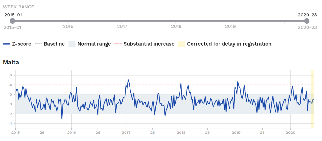
During the Corona period, Malta did not even exceed its own small Jan 2020 mortality spike caused by normal flu activity, and did not come close to several flu spikes in the late 2010s. There is no evidence of anything unusual.
The 2019-20 season including Corona may have been the fifth-worst flu wave in Malta in the past six seasons.
Here is the zoom-in on 2020 only:
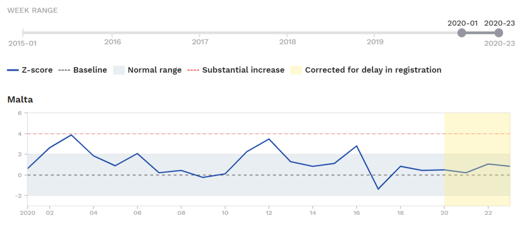
You can see that Malta was above the normal-mortality range during Weeks 2, 3, 11, 12, and 16 only. None of these weeks had a significant number of corona-positive deaths. In fact, from what I can tell Week 16 had zero corona-positive deaths.
Malta has had only 9 corona-positive deaths, with only none in June as of June 14. Total expected deaths for the period March to May (based on 2019 mortality): 925.
In quantitative terms, all-cause mortality was above the baseline during the coronavirus period in 2020 for a total of +12 z-scores — but it is unlikely the nine corona-positive deaths can possibly account for this, more likely it is normal fluctuation.
A winter flu wave in early 2019, meanwhile, pushed all-cause mortality in Malta up by +34 z-scores.
Mortality excess during the peak corona period in 2020, whatever the cause, was only 0.35x the level of a flu wave one year earlier, which itself was comparable to winter flu waves seen almost every year.
(See the final section for a summary of the magnitudes of all-cause-mortality excesses in all the reviewed countries compared to their own mortality-excesses in a late-2010s flu spike, and how Finland’s 0.35x compares.)
The Panic in Malta
Malta panicked and tried to impose an island-fortress-like state on itself in March, a Pyrrhic victory over a flu virus. It will take a significant GDP hit for their trouble; as they depend more than most in the EU on tourism, for one thing, their lockdown has been self-defeating and for unclear purpose given that so few died (nine people of a nearly 500,000 resident population).
______________
Review of Group 2.
The ten places reviewed so far (Berlin, Hesse, Denmark, Estonia, Greece, Hungary, Norway, Austria, Finland, Malta), stepping back, can all be said to show nothing unusual in the (total, all-cause) mortality numbers.
Were an island hermit without access to the Internet or media shown these numbers alone, and then told there was a mass panic about a virus apocalypse in the first months of 2020, he would imagine his interlocutor was joking. A mass panic given such data would seem like a “tinfoil fat” kind of thing, something from the nether-regions of anti-government conspiracy theorizing. Not possible in reality, he would think.
There are two categories left to review: Countries that briefly exceed the Substantial Increase range (3 weeks or less) and those that exceed the Substantial Increase range for a sustained period (4 or more weeks).
________________
Group 3. Countries that briefly exceeded the Substantial Increase mortality range (1-3 weeks)
These are: France, Ireland, Luxembourg, Portugal.
__________________
- FRANCE
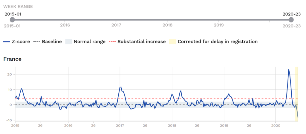
You can see that France‘s mortality spike in 2020 during the Corona period is “high but not wide” when compared to recent-past spikes. In total magnitude, the 2020 spike is actually about the same as the 2016-17 winter spike:
A 2016-17 flu wave netted +70 z-scores of excess mortality in France, while the 2020 spike shows an aggregate of +84 z-scores (for Weeks 11 to 17).
The total ‘Corona’ hit in France is therefore about the same in total magnitude as its a totally ignored flu wave three years earlier; Corona comes in at 1.2x the 2016-17 flu spike’s level.
(See the final section for a summary of the magnitudes of all-cause-mortality excesses in the reviewed countries, compared to their own mortality-excesses in a late-2010s flu spike, and to see how France’s 1.2x compares.)
Below-Average Mortality in France already by late April
As always with peak-flu events, spikes are followed by periods of below-normal mortality. France in late May and June may see its lowest number of deaths in this period in years, but this will have to be returned to in July or August to confirm the apparent pattern.
Here is the zoom-in on 2020 for France:
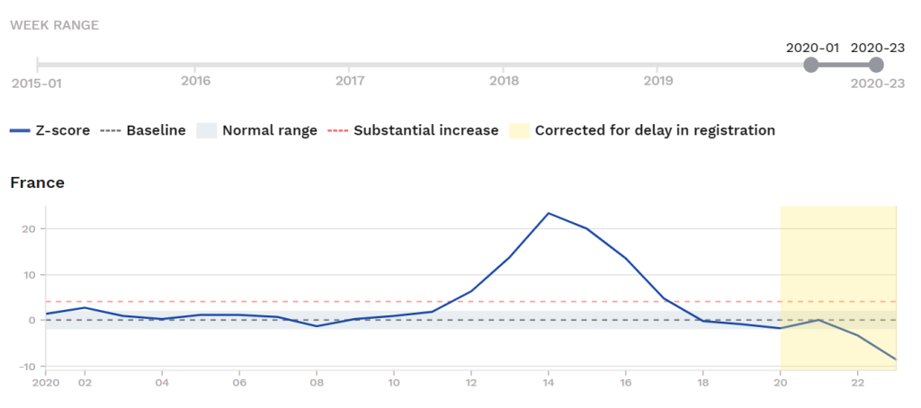
The fall in mortality below the baseline (the lower dotted line) from Week 18 (late April) again shows the “culling effect” in practice: Many among those closest to death are taken during a peak-flu-event and are no longer available to be new deaths in subsequent weeks.
The mortality deficit for late April to early June (Weeks 18 to 23) appears to be as high as -15 z-scores. There is probably more of this coming. For now it looks like possibly one-in-four corona-deaths in France were deathbed (very-imminent-death) patients, and of course almost all the others were ill and elderly, too, even if not imminent-death-absent-corona patients.
France’s expected-mortality-deficit was, in preliminary data, even below the lower-bound of the normal range by Week 22 and 23, but we will have to wait to see if this holds, given reporting delays.
France reports 29,400 corona-positive deaths as of June 14. Total expected deaths for the period March to May (based on 2019 mortality): 150,000. Early indications suggesting expected-mortality-deficit in June will reduce this further, and there are very few new corona-positive deaths in June, making foor <30,000 corona-positive deaths during a period with 200,000 expected deaths, including those dying “with” and not “from ” the virus.
The total share of corona-positive deaths in France to nursing home patients was 55%.
France’s Draconian Lockdown
The decision to lockdown went further in France than in most places, but the escalation spiral from late February to mid- and late-March is recognizable. Police enforced a dystopian “no one may be outside without a written declaration of what they are doing” policy effective as early as March 23 and a total ban on travel more than 100km from one’s registered home address.
One mini-drama in France was the the spread of the virus on their navy’s flagship, the nuclear aircraft carrier Charles de Gaulle. Despite over a thousand confirmed cases among the crew, there were zero deaths. The cases were reported, but I have a feeling the “zero deaths” part was not.
The lockdown put millions out of work in France, to Great Depression-era levels, and triggered race riots in April (after weeks of the strict lockdown as explained above), a precursor to the much larger, international Black Lives Matter protest/riot cycle in late May and early June.
In May, researchers reported a case of a man with no travel history who was admitted to a hospital in France with flu on Dec. 27 who was positive for the Wuhan-Coronavirus, which suggests transmission was active in France already by mid-December or earlier. “If so, why did the virus only spike in March?” Coronaviruses always tend to spike late season; this has always been true and is not a surprise that this one did in 2020.
__________________
- IRELAND
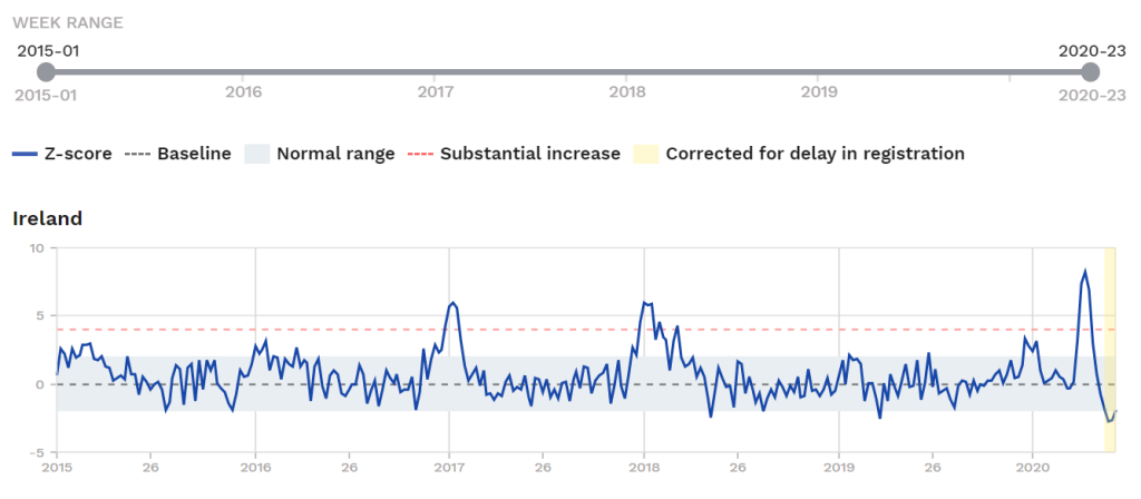
In Ireland we see a total-mortality bump above the normal range beginning late Week 13 and ending early Week 17 (ca. 3.5 weeks), with Ireland falling into mortality deficit as of Week 19 and holding in Week 20, probably also 21 and 22.
The total magnitude of the hit from Wuhan-Corona in Ireland in 2020 was less than in its own 2016-17 and 2017-18 flu seasons.
Here is a zoom-in on 2020:
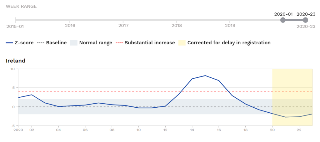
Ireland’s mortality spike during the Corona wave in 2020 was +29 z-scores, with the post-spike deficit-mortality already at -10 z-scores (subject to revision); see coming July 2 update.
A winter flu wave in 2017-18 netted +57 z-scores of excess during the spike period (2017 Week 50 to 2018 Week 14). The spike in 2020 amounted to a mere 0.5x the recent-high 2017-18 flu wave.
(See the final section for a summary of the magnitudes of all-cause-mortality excesses in the reviewed countries, compared to their own mortality-excesses in a late-2010s flu spike, and to see how Ireland’s 0.5x compares.)
The Republic of Ireland reports 1,705 corona-positive deaths as of June 14. Total expected deaths for the period March to May (based on 2019 mortality): 7,800.
If the magnitude of the post-Week-18 mortality deficit is anything to go by, up to one-in-three of the deaths were imminent anyway, and about 85% of the remaining deaths were over 65 with serious health conditions.
And despite the spike, it appears there will NOT be an aggregate excess mortality above the normal range for the first six months of 2020 in Ireland; we will have to wait to the July 16 update to judge this with certainty.
Ireland’s Lockdown Decision
Ireland pulled the shutdown and lockdown triggers in March in response to media, and pressure before the UK did; the UK, at first steadfastly holding to a Swedish-style response, caved in about a week after Ireland did on the response-escalation-spiral. There was probably a contributing role played by the Irish lockdown, given the ties between the countries, the shared language and border.
I am not sure to what extent the lockdown was regretted by Irish authorities, dealing themselves a serious GDP hit (with associated worse health outcomes and more) over this one virus, but we can gather as much based on their early easing of restrictions (by early May).
__________________
- LUXEMBOURG
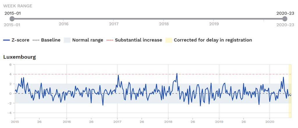
Luxembourg shows a brief and small spike in mortality which does not exceed its own winter 2016-17 or 2017-18 spikes.
Here is the zoom-in for 2020:
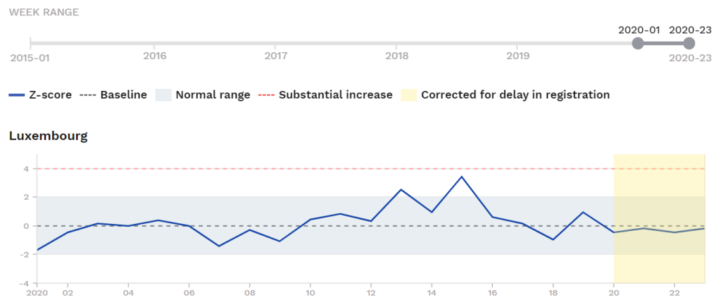
You can see that slightly elevated mortality holds for Weeks 13 to 15 (March 22 to April 11), but Week 16 to 22 appear to be aggregate mortality-deficit (subject to revision for weeks 21 and 22). This small bump amounts to only +8 z-scores of excess.
Meanwhile a small flu wave in early 2018 netted Luxembourg +17 z-scores of excess (Weeks 5 to 12 of 2018).
The small all-cause-mortality bump observed in March and April 2020 was only half (0.5x) as much as a flu wave in early 2018.
(See the final section for a summary of the magnitudes of all-cause-mortality excesses in the reviewed countries, compared to their own mortality-excesses in a late-2010s flu spike, and to see how Luxembourg’s 0.5x compares.)
There is again not much of a story here, especially given that there had been no winter spike before Week 13 in the season (see first graph).
Luxembourg reports 110 corona-positive deaths as of June 14 (none in June). Total expected deaths for the period March to May (based on 2019 mortality): 1,075.
A small state, they had no choice to but to fall in line with the panic rising and put in lockdown measures in mid-March as all the large surrounding states (France, Belgium, Germany) did.
It does not appear Luxembourg will have any excess in total mortality for the first six months of 2020.
__________________
- PORTUGAL
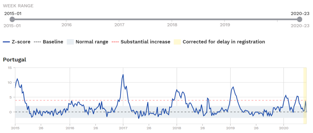
In Portugal we see a brief bump associated with the Corona period, above the Substantial Increase threshold for three weeks (Weeks 13 to 15) (March 22 to April 11), but this small bump is overshadowed by winter spikes almost every other year since the dataset begins in 2015.
There is even a small spike dating to late December 2019 and carrying into early February 2020 of the same magnitude as the Wuhan-Corona wave.
The magnitude of the excess associated with the coronavirus spike in Portugal in March-April 2020 is +27 z-scores.
The biggest spike of the late 2010s in Portugal appears to be the 2014-15 flu spike. While start of which is just cut off in the database here, 2014-15 spike appears to be +135 z-scores.
This means the 2020 coronavirus wave in 2020 therefore had only 0.2x the impact of the 2014-15 flu wave in Portugal, a negligible level in these relative terms. If there was no emergency in 2014-15, there ought not have been one in 20202 over Wuhan-Corona.
(See the final section for a summary of the magnitudes of all-cause-mortality excesses in the reviewed countries, compared to their own mortality-excesses in a late-2010s flu spike, and to see how Portugal’s 0.2x compares.)
Portugal Locked Down Late but was Still only Mildly Hit
Portugal was later than many in pulling the shutdown/lockdown/emergency trigger (March 18, shortly after the Neil Ferguson predictions were releasing that called for “millions of deaths”). A mild bump followed and mortality in Portugal returned to the normal range by ca. April 21.
That the lockdown was regretted by Portugal’s leading figures and government is seen in the swift scale of re-openings occurring already by early May. (This at the exact same time as US state governors continued strict lockdowns, and the US media engaged in a curious demonization campaign against anti-lockdown protesters, calling them “terrorists;” see also Part IX in this context [“‘Corona-Paranoia’ and the case of pro-Panic US Congresswoman Haley Stevens, a character study“]. Significant disruptions to US life, imposed mainly by blue-state governors in an election year, remain in effect as of this writing in mid-June.)
Portugal reports 1,515 corona-positive deaths as of June 14 (ninety in June). Total expected deaths for the period March to May (based on 2019 mortality): 28,000.
______________
Review of Group 3
So much for the third category, countries that had some noticeable, if modest, total-mortality rise during Corona (France, Ireland, Luxembourg, Portugal). None of these were particularly alarming or shocking in recent-historical perspective (as is very clear from the 2015-to-2020 graphs), and it’s unlikely the governments, if they knew what they did now, would have imposed lockdowns in March.
Curiously we notice a pattern with the groups so far, arbitrarily cut off based on the thresholds in the EuroMOMO dataset: They resemble the tiers of countries in Europe that get sorted roughly in the same way across any number of indicators. Remember the so-called “PIIGS” of the early 2010s? Here in Group 3 we see two of them. Two more are coming in Group 4. (Greece alone was remarkably lightly touched by Corona.)
Meanwhile, the creditor countries of northern Europe like Germany (Hesse, Berlin) tend to be more lightly affected.
This immediately suggests that the degree to which countries are hit by this one flu virus, or any flu viruses partly depend on local circumstances, socioeconomic conditions, institutions of various kinds. Italy and Spain (coming in Group 4) have both had dramatic winter flu spikes in recent years, not long after their debt crises.
Next comes the fourth and last category, those countries in which mortality excess during ‘Corona’ exceeded the Substantial Increase range for at least four weeks.
To the extent the pro-Panic side — or the remnant of the pro-Panic side, or the “bitter-enders” who will continue to insist Corona was a major, major threat — they will all point to one or more of these countries, and so a close analysis of these is useful.
The case of Sweden is maybe worth the closest look of all, as usual, being that they imposed no general shutdown/lockdown.
_________________
Group 4. Countries that exceeded the Substantial Increase mortality range for at least four weeks
These are: Belgium, Italy, Netherlands, Spain, Sweden, Switzerland, and the constituent countries of the UK.
__________________
- BELGIUM
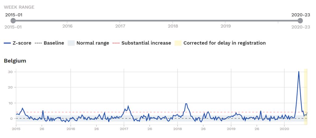
Belgium hovers above the substantial-increase range from Week 12 to Week 19 and is back to the normal range as of Week 20 (probably back to normal by May 9).
Belgium’s total excess-deaths above the baseline during the spike in 2020 was +110 z-scores, which significantly exceeds its recent-high winter spikes of 2017 (+46 z-scores) and 2018 (+47 z-scores).
Excess-mortality for Belgium in the 2020 spike is 2.3x the 2017 and 2018 spike, looking at only the spike period itself.
(See the final section for a summary of the magnitudes of all-cause-mortality excesses in the reviewed countries, compared to their own mortality-excesses in a late-2010s flu spike, and to see how Belgium’s 2.3x compares.)
Given that more than 50% of corona-positive deaths in Belgium were in nursing homes, we expect downward pressure on total mortality in coming weeks, perhaps beginning Week 24. “The higher they go, the farther they fall.” Such a wider measure of mortality could easily push this below 2x over the 2017 and 2018 spikes.
Half-year total-mortality (Jan. 1 to June 30, 2020) measured as a full period in Belgium will not, it seems, exceed the Substantial Increase range. Full-year mortality may well return to at or very near the normal range (to reach t he normal level, total-mortality would have to average about -1 z-score/week for the second half of the year, in practice meaning a sustaned summer period of below-baseline mortality; we shall see.
To the extent that the unprecedented Lockdown policy also pushed up mortality among some too frightened to seek medical treatment, this would also imply a somewhat lower difference. This would have to be investigated more (it certainly applies to the UK) and would also firmly push the Belgium spike to the “less than 2x the impact of the peak flu waves of the 2010s.”.
Belgium appears to have been right at the middle of the panic cycle and pulled its lockdown trigger in the second week of March (Week 11). Here is a zoom-in on 2020:
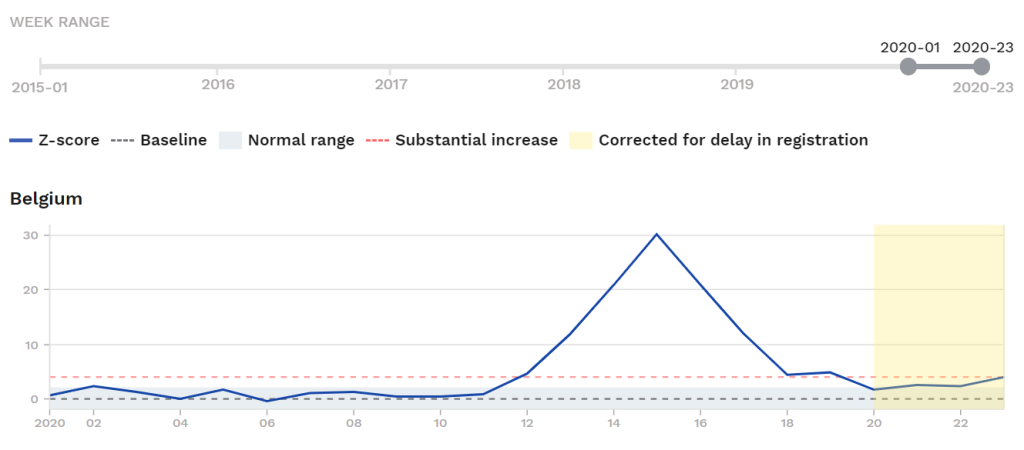
Belgium reports 9,655 corona-positive deaths as of June 14 (169 in June) (these numbers include untested presumed positives in Belgium’s controversial method of counting), with nearly 5,000 of these being nursing home patients. Total expected deaths for the period March to May (based on 2019 mortality): 27,250.
What Happened in Belgium?
Belgium’s excess mortality, along with England’s, may be the highest in Europe, and it is unclear why.
We know about the nursing homes, hit hard in Belgium as elsewhere, but what else might explain the high excess?
One possibility, suggested by Dr. Wodarg and others, is that first-world countries with more Africans and Middle-Easterners may have higher death tolls because some of the earlier treatments used were deadly in some cases to those with malaria-region ancestry. This may also apply to England and France as well as Belgium; corona-positive death data by race would be helpful there. We know it applies to Sweden, too, with Somalis among the earliest victims (Sweden’s population has increased by one million since 2010s on the policy of bringing in and hosting refugees.)
__________________
- ITALY
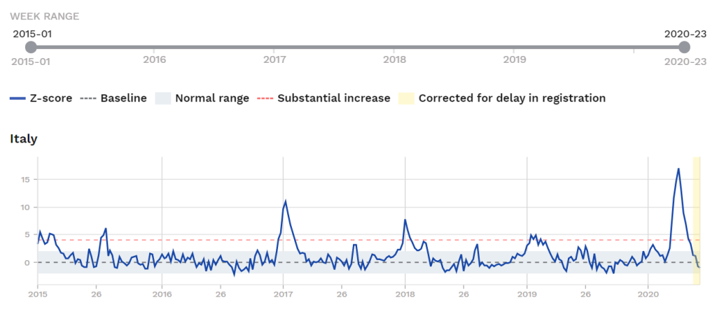
Italy got probably the most ‘Corona’ coverage of any country in the world excluding China, certainly the most attention in Europe. The news and media coverage out of Italy were persuasive in convincing many, in winning converts to the pro-Panic side in the critical periods of early and mid-March. “Italy closed off an entire region; the virus must be serious,” being a common refrain of the time, in addition to vague references to “swamped hospitals.”
Now, it’s true that we see a distinct total-mortality spike in Italy. Total mortality exceeds the normal range starting about mid or late Week 10 (March 1 to 7).
Notice, though, that there had not been any significant mortality spike in the 2019-20 season before this. There had been no no period of sustained high mortality at all since a 2018-19 flu wave subsided in early Feb. 2019, making for thirteen months of sustained, normal-range mortality for Italy before ‘Corona.’ A weak wave had come and gone in January 2020, but this was weaker than flu waves in Italy in almost any given year of the 2010s.
Estimating the magnitude of the Wuhan-Corona Wave in ITALY vs. its own recent-past flu waves
For the spike period of Weeks 10 to 19 of 2020, we can count +89 z-scores of total deaths in Italy.
For the recent-high flu wave of 2016-17 (2016 Week 50 to 2017 Week 7, an equal period of ten weeks), we count +51 z-scores of excess deaths above the baseline.
This puts 2020 at 1.75x the excess seen in the 2016-17 and 2017-18 spikes.
(See the final section for a summary of the magnitudes of all-cause-mortality excesses in the reviewed countries, compared to their own mortality-excesses in a late-2010s flu spike, and to see how Italy’s 1.75x compares.)
If a sustained below-average mortality follows in June and July 2020 (as it is sure to given the age-condition profile of the corona-deaths), this 1.75x figure will likely go down, on a wider time-horizon comparison.
Indications are that mortality in Italy may have fallen below the baseline already sometime in Week 22 (late May), which is almost certain to sustain given the age-and-condition profile of the deaths.
Zoom-in on 2020 for Italy:
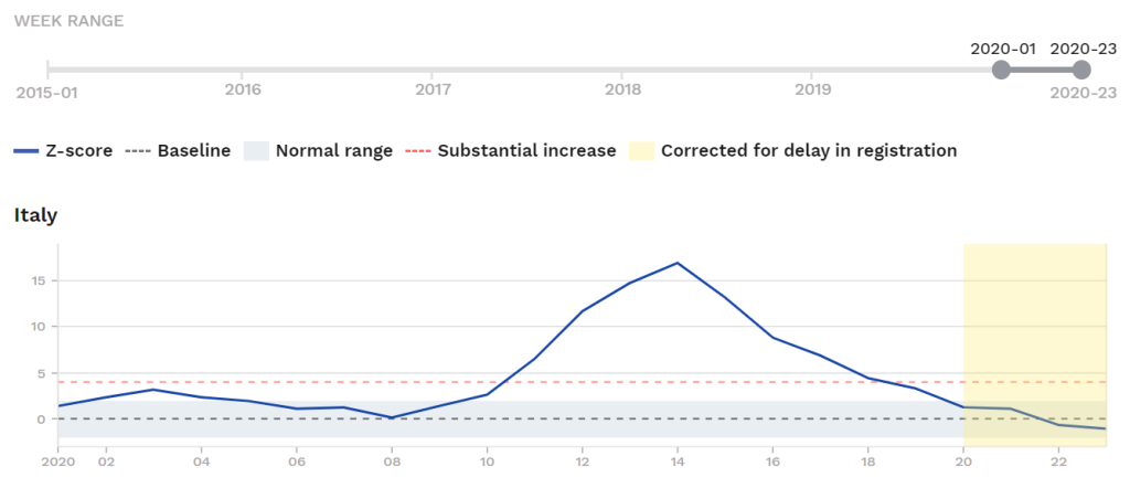
Italy was back below the Substantial Increase threshold by about April 29 (mid Week 18), back in the the normal range of mortality by ca. May 9 (late Week 19 or early Week 20), and looks set to drop below the normal range to significantly below-normal mortality in the summer months.
At this point it should be remembered that in lockdown/panic countries/regions, there are two categories of excess death: Virus-caused deaths and Panic-induced deaths (the latter being other those abandoned by caretakers or individuals too terrified by media coverage to seek basic treatment an died, which definitely applies to the UK). “It is known from northern Italy that the crisis there began with a panic-induced collapse of nursing care for the elderly,” and some of the excess is accounted for that way.
As some of the deaths were Lockdown-caused and as the excess deaths were primarily drawn from the weakest and sickest cohorts, there will be downward pressure on mortality in Italy for some time. While we wait for more data, for now we can make a best-guess that the true medical impact of Corona in Italy resembles the flu waves seen several times in the 2010s, probably no more than 1.5x the level of the 2017 of 2018 flu-spikes. I am not sure the magnitude of the lockdown-induced excess deaths, but they might plausibly push the Wuhan-Coronavirus’ true medical impact down to comfortably <1.5x the level of the peak flu waves of the 2010s.
As Dr. Wodarg said in March: “What you are seeing is the is the flu season in Italy.”
There is room for dispute here on exactly what the final ‘score’ was, but one thing that can be absolute, and totally ruled out is that this coronavirus was alarmingly dangerous, or an “apocalypse virus.”
Total corona-positive deaths in Italy vs. the notorious Ferguson projections
Italy reports 34,345 corona-positive deaths as of June 14 (900 in June), with almost all ofthese being of retirement age. Total expected deaths for the period March to May (based on 2019 mortality): 161,750.
According to the influential Imperial College predictions released March 16, a country of Italy’s size and density should have had many hundreds of thousands of excess deaths (rather than the 161,750 expected on a baseline basis). The Ferguson model implied perhaps 750,000 deaths for Italy (virus-deaths plus swamped hospital deaths) without a draconian lockdown and maybe still with one. These hundreds of thousands of deaths never materialized, of course, but saturation media coverage gave the impression of something on that scale anyway.
Is the Lockdown regretted in Italy? The intense media campaign to promote the virus was nowhere more intense than it was in Italy, and it appears that a strong PC line developed with pro-Panic forces in total control. By June, it is likely much is regretted. The predicted disaster was a media-induced mirage.
__________________
- NETHERLANDS
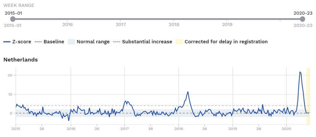
In the Netherlands, we see a distinct spike starting in Week 12 and subsiding in Week 19 (above the normal range from mid-March to early May).
Something to immediately notice: There had been no period of elevated mortality for two years prior. A previous winter flu wave peaked in early 2018 and faded by Week 14 2018, making for exactly two years without a flu spike. This meant a large number of those marginally clinging to life had not died who, given a peak flu event, may well have, and some of these are among the deaths in the spike.
The second observation is that while the spike is high, it is not wide.
Here is a zoom-in on 2020:
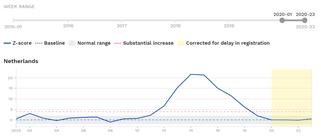
Note that Netherlands’ mortality is right at the baseline for Weeks 20 to 22, and so far there is to drop-off to below-normal mortality observed.
The magnitude of the Wuhan-Corona Wave in the NETHERLANDS vs. its own recent-past flu waves
The 2020 spike amounts to +102 z-scores above the baseline (as measured by EuroMOMO) in eight weeks.
The wider winter spike in 2017-18 amounted to +79 z-scores of excess (2017 Week 50 to 2018 Week 13).
This means the Wuhan-Coronavirus’ impact in the Netherlands was 1.3x that of a 2017-18 flu wave, a tremendously underwhelming figure given the apocalyptic terms in which Corona was marketed by the pro-Panic side, and given the unprecedented, socially- and economically-devastating measures taken which could themselves lead to worse health outcomes in various ways.
(See the final section for a summary of the magnitudes of all-cause-mortality excesses in the reviewed countries, compared to their own mortality-excesses in a late-2010s flu spike, and to see how the Netherlands’ 1.3x compares.)
The Netherlands reports 6,059 corona-positive deaths as of June 14 (<100 total in June in its first two weeks, the epidemic long over). Total expected deaths for the period March to May (based on 2019 mortality): 38,000.
The Ferguson model would have implied deaths in the Netherlands as high as 150,000 to 200,000. Reality never came close.
The effect on final-year mortality will not apparently be very high. The year 2018 came in at 153,363 total deaths in the Netherlands (0.893% of resident population), and based on the magnitude of the corona spike, 2020 could be 155,000 (0.894% of resident population), but this depends on what the early 200-21 flu season is like.
The Netherlands’ attempt to hold the line on a Swedish-style response falters, fails in mid-late March
Lockdown measures were not introduced in the Netherlands, but mandatory closings were widespread and lasted into May; in retrospect the government clearly panicked and was unable to resist not just sustained international media pressure but the shutdown decisions made by the the big players of its EU partners.
Despite real efforts at maintaining a Swedish-style non-panicked response, the line could not hold in March; the Netherlands finally “caved in.” It appears that the Dutch government quite badly damaged its own economy unnecessarily (for a flu wave that netted 130 deaths to 100 in the 2017-18 flu wave). They are in plenty of company.
__________________
- SPAIN
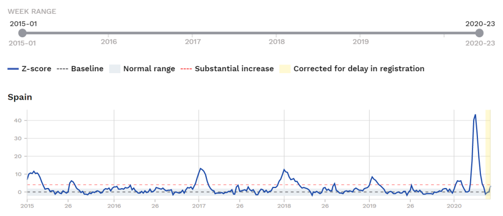
The spike in Spain looks dramatic, but as with other cases it is also high but narrow. Of interest is the total area under the spikes (representing excess deaths), not the height reached.
Here is the zoom-in on 2020:
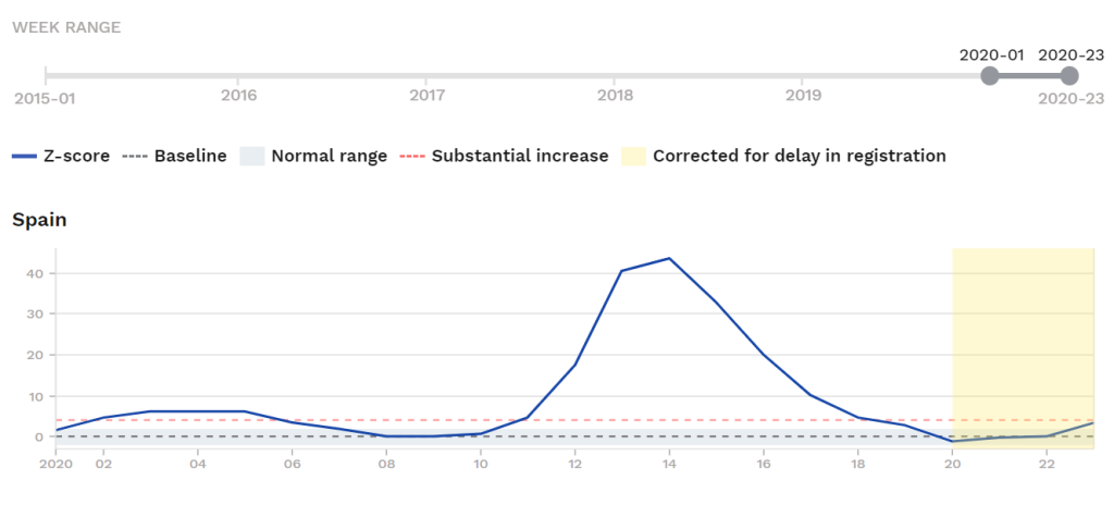
Spain exceeds the Substantial Increase threshold from ca. March 14 to ca. May 2 (late Week 11 to late Week 18 or early Week 19), and is in mortality deficit outright already as of mid-May (Week 20 for sure; preliminary data also has Spain at below-average mortality for Weeks 21 and 22).
Of note in Spain’s case, as in many of the countries analyzed here, a period of mortality deficit preceded the spike, in this case a full year of mainly below-average mortality.
The magnitude of the Wuhan-Corona Wave in SPAIN vs. its own recent-past flu waves
Adding up the excesses during the ‘Corona’ wave of 2020 in Spain, we get +177 z-scores (Week 11 to Week 19, 2020).
Adding up the excesses in the 2017-18 flu wave, we get +128 z-scores (Week 46 of 2017, to Week 15 of 2017, the long period above the normal range that season).
This means the 2020 coronavirus wave was 1.38x the magnitude of the 2017-18 flu wave in Spain; this is comparable to the figure in the Netherlands (1.3x) and lower than Italy’s (1.75x), though in Italy’s case the number is high because of the panic-driven collapse of nursing homes in some areas, and lower than Belgium’s 2.3x.
(See the final section for a summary of the magnitudes of all-cause-mortality excesses in the reviewed countries, compared to their own mortality-excesses in a late-2010s flu spike, and to see how Spain’s 1.38x compares.)
Spain reports 27,136 corona-positive deaths as of June 14 (almost none in June; the epidemic long over). Total expected deaths for the period March to May (based on 2019 mortality) in Spain is: 105,000.
The Ferguson predictions implied hundreds of thousands of deaths for Spain, perhaps as many as 600,000 for the period rather than the baseline 105,000, with the excess largely direct-virus deaths and some swamped-hospital deaths. Nothing like this occurred, of course. The pro-Panic side will point to the Lockdown, which Spain embraced in mid-March, one of the many countries to fall to the panic and deliberately harm its own economy.
Spain’s Lockdown: Regretted?
Does Spain regret the decision to cave into the Panic in mid-March? Signs point to ‘Yes.’ Authorities were actively trying to backtrack by early May, about the time deaths were again fast approaching the normal range.
(This as the governors of big states in the US continued the no-light-at-the-end-of-the-tunnel, unending lockdowns which triggered riots and looting by the end of the month of May.)
The backtracking was in full force by Week 18 (see graph), at which time deaths had only just recently declined back to the Substantial Increase range, with the final hit more-or-less in the range of a 2010s-era flu spike in Spain (1.38x the level of excess deaths; see above). Spanish authorities and the cultural/narrative-shaping apparatus in Spain wanted recovery, and at least my reading of the situation suggests a tacit admission of mistake, just as the Danish Prime Minister herself did a few weeks later (See ‘Denmark‘ section).
__________________
- SWEDEN
This is one is of most interest of all of these, given that Sweden is our natural experiment, with a very limited government hand, no real shutdowns and no general lockdown.
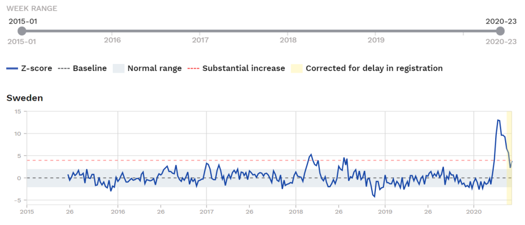
The first thing to notice: Sweden was in a net mortality deficit from about Oct. 2018 to late March 2020, and the 2018-19 flu season was so weak that there was no visible spike at all. Had their been higher flu activity in 2018-19, or 2019-20 in the earlier part of the season, many of the deaths represented in the 2020 spike would have been distributed among lesser spikes in those periods.
Sweden’s coronavirus epidemic curves have been graphed a lot here at Hail To You, with this one updated recently (June 5):
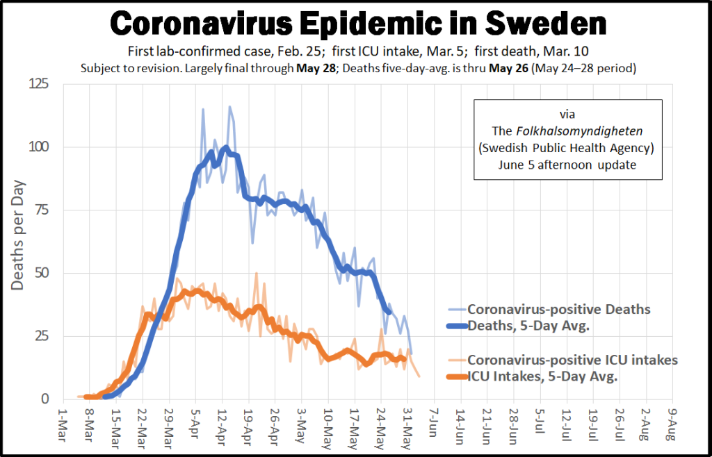
The deaths curve begins to rise during Week 12 (March 15 to 21) but rises to a significant level by the end of the next week, Week 13 (March 22 to 28).
Week 13 had a total of 236 corona-positive deaths, while a normal week’s baseline would be around 1,850 at this time of year. This aligns exactly with the total deaths curve as shown in EuroMOMO. Here is the zoom-in starting March 2020 at the same point as the Deaths/ICU graph:
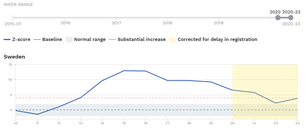
Sweden shows deaths above the Substantial Increase threshold by very end (probably last day only) of Week 13 (March 22 to 28).
Here are the coronavirus-positve deaths in Sweden for the relevant periods, Week 12 (which remained in the normal range at only +1 z-scores) and Week 13 (which broke above the Substantial Increase threshold (+4 z-scores) and then Week 14 (+10 z-scores, where it held for about six weeks):
[Week 12] (44 corona-positive deaths)
– March 15: 2 deaths
– March 16: 1 deaths
– March 17: 6 deaths
– March 18: 7 deaths
– March 19: 9 deaths
– March 20: 8 deaths
– March 21: 11 deaths
___________________________
[Week 13] (190 corona-positive deaths)
– March 22: 11 deaths
– March 23: 21 deaths
– March 24: 22 deaths
– March 25: 31 deaths
– March 26: 32 deaths
– March 27: 35 deaths
– March 28: 38 deaths
___________________________
[Week 14] (451 corona-positive deaths)
– March 29: 44 deaths
– March 30: 49 deaths
– March 31: 53 deaths
– April 1: 70 deaths
– April 2: 78 deaths
– April 3: 71 deaths
– April 4: 86 deaths
The peak in total deaths for Sweden was the six-week period Weeks 14 to 19 (March 29 to May 9), when Sweden recorded an aggregate +64 z-scores of excess mortality. In this period, coronavirus deaths averaged 560 per week (counting all corona-positive deaths including those that would have died anyway at the exact same time), on a baseline line mortality of 1,800 per week for this time.
By the way, here is the companion graph to the above, the actual coronavirus-positive Deaths curve graph with the Neil Ferguson predictions:
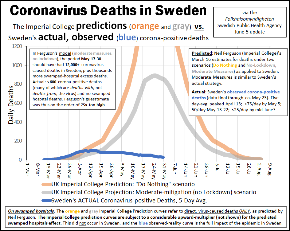
Here is the full table of coronavirus-related ICU intakes and corona-positive deaths in Sweden as of the June 5 update (click to expand):
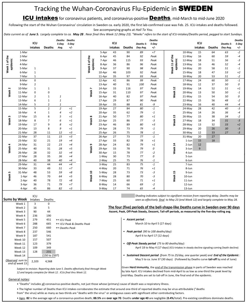
Magnitude of Sweden’s mortality excess during the 2020 spike is lower than for several other countires
For the entire period of elevated mortality during Corona (not just the peak), Sweden had +87 z-scores of excess deaths, for late March into the start of the tail-off period in early June (Weeks 13 to 23); signs of a return to the normal range and below it will begin in Week 24 and continue for a while. Closing the book on Corona in Sweden (the spike plus the likely coming mortality deficit) might reasonably be done with the October 1 2020 update.
In recent-history perspective: Sweden’s highest period of excess mortality in the EuroMOMO database is a two-peak period in 2018 (Week 6 to 30), which netted +42 z-scores of excess in the (dual-)spike period.
Sweden’s 2020 mortality-excess spike is therefore at 2.07x its own recent-peak in 2018. But Sweden is not known for winter flu death spikes, and an international context may be of use:
Sweden’s +87 z-score excess during the peak is LOWER than the excesses seen in Spain (+177 z-scores), Netherlands (+107 z-scores), Belgium (+110 z-scores), Italy (+89 z-scores), and England (+214 z-scores), showing again that there is no relation between the measures employed (lockdown) and the death rate.
(See the final section for a summary of the magnitudes of all-cause-mortality excesses in the reviewed countries, compared to their own mortality-excesses in a late-2010s flu spike, and to see how Sweden’s 2.07x compares.)
Sweden’s period of elevated mortality may have ended May 23
Sweden appears to be back below Substantial Increase by mid or late Week 21.
Comparing this, from EuroMOMO, with the actual corona-positive deaths figures we have from the Swedish Health Ministry (see this table, June 5 update), this appears to be exactly May 23.
The fourteen days before May 23 averaged 55 deaths (which also holds also for the immediately preceding period, May 20-22), then on May 23 it drops to 42 deaths. It stays lower and continues its long-run decline (staying at 35/day for the fourteen days starting May 23).
The tail-off in the corona-positive deaths curve in Sweden has been underway for three weeks as of this mid-June writing.
When will below-average mortality begin in Sweden?
All indications are that a significant mortality deficit (below-baseline mortality) is imminent in Sweden, given that reportedly 75% of the corona-positive deaths were to people in nursing homes or receiving nursing care at home.
The high death toll in nursing homes is attributed to an abandonment of duties by refugee staff, as was also observed in some other countries which depended heavily on transient migrant labor for these jobs; in this, Sweden resembles northern Italy.
While the late March to May spike is the biggest mortality rise in Sweden since at least mid-year 2015, probably holding for some or all of late June, July, and August 2020.
Will there be a full-year rise in total mortality in Sweden?
It’s unclear. If there is a full-year excess over the long-run average, it will not be by much, as also calculated in Part XII. Nothing in the EuroMOMO total-mortality data contradicts that.
From the excess mortality z-score discussion above, we can calculate that +1 z-score of excess mortality in Sweden is probably within the +35/day to +42/day range (total corona-positive deaths during the peak period [*.67 or *.80]/ z-score excess during the peak period). The exact number depends on how many were “would have died anyway at the exact same time.” The Coronavirus-period-associated-excess of +87 z-scores, which may rise to +95 or +100 given trends and the continued sustained decline of the Deaths curve in early June, for Sweden therefore amounts to no more than 4,000.
Now look at total deaths by year in Sweden since 2010:
- 2010: 90,487 deaths
- 2011: 89,938 deaths
- 2012: 91,938 deaths
- 2013: 90,402 deaths
- 2014: 88,976 deaths
- 2015: 90,907 deaths
- 2016: 90,982 deaths
- 2017: 91,972 deaths
- 2018: 92,185 deaths
- 2019: 88,766 deaths
Note that the total population in Sweden rose by one million during this time period (9.4 million to 10.4 million) due to the policy of bringing in mainly Mideast refugees, especially during the 2015-16 “migrant crisis” when several hundred thousand entered, very few of whom were of ages likely to die soon.
In any case, note that the mild year of 2019 had -3,500 deaths below the previous year (2018). This might be thought of as the normal fluctuation range — given that there was no alarmed/panicked reaction to the 2017-18 flu season.
We have just calculated that t he maximum range of coronavirus-period-associated excess deaths is not higher than 4,000.
We can conclude that the Coronavirus epidemic represents a normal fluctuation in deaths in Sweden, comparable to the difference between 2018 and 2019; a low season followed by a high season, and life goes on as it always does.
__________________
- SWITZERLAND
I touched on Switzerland back in mid-April in Part III, in a table of total mortality in Switzerland up to that time. Switzerland showed no mortality excess for the year as of early April (the threshold lines in the table there go by slightly different definitions than EuroMOMO uses).
We now have data for almost two further months, including the entirety of thepeak period of Corona in Switzerland, therefore we can now look back on the full magnitude of the epidemic in recent-history perspective:
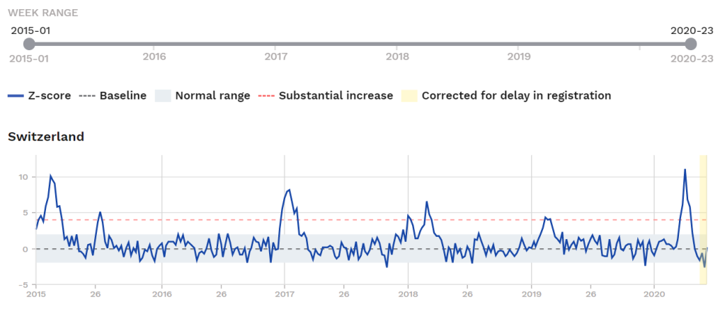
Here is the zoom-in on 2020:
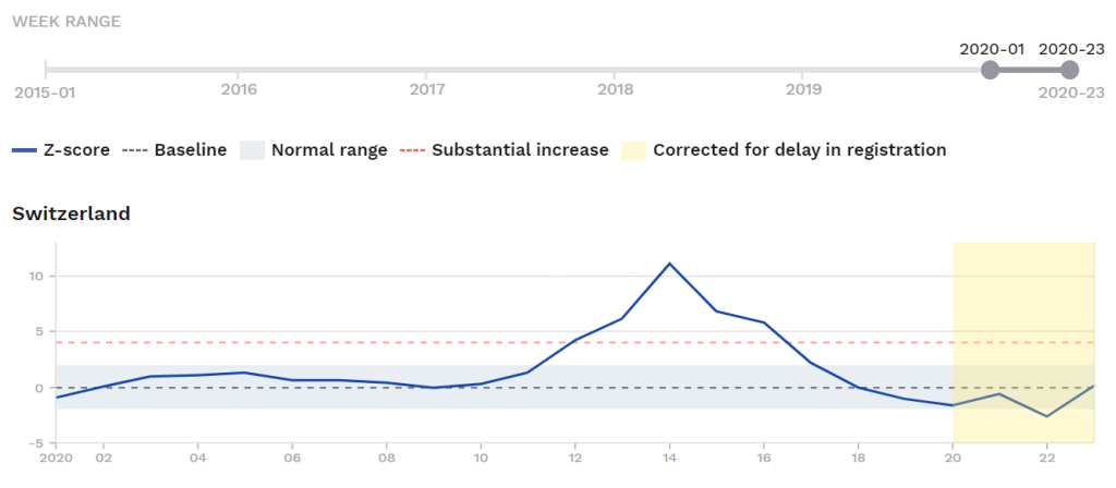
Wee see that Switzerland exceeds the Substantial Increase threshold from late Week 12, peaks in Week 14, and is back below the Substantial Increase line by early Week 17. This puts the Coronavirus-associated excess mortality period for Switzerland is between about March 21 and April 19.
The total magnitude of the ‘Corona’ hit does not appear to exceed any of the 2014-15, 2016-17, 2017-18 flu spikes, another highly underwhelming figure given the extreme measures taken and media hype.
Magnitude of the Excess in Switzerland
Adding up the weekly excess during the elevated mortality period, in 2020, we see a +36 z-score “hit” in Switzerland associated with the Wuhan-Corona spike.
A flu wave in 2014-15 had about +75 z-scores of excess and the flu spikes of 2016-17 and 2017-18 both had about +50 z-scores of excess, all exceeding the 2020 coronavirus-associated wave; Corona-associated excess mortality in Switzerland amounts to a mere 0.5x its own flu wave of 2014-15. (That is, for every 100 excess deaths during that flu wave, there were 50 excess deaths in the 2020 corona wave.)
(See the final section for a summary of the magnitudes of all-cause-mortality excesses in the reviewed countries, compared to their own mortality-excesses in a late-2010s flu spike, and to see how Switzerland’s 0.5x compares.)
Below-Average Mortality in Switzerland follows the spike
As in many other cases examined above, we see a mortality deficit for Switzerland already in Week 18 (late April), holding Weeks 19 and 20, and probably for 21 and 22 (i.e., through all of May). This deficit period already “cancels out” some of the excess in the spike period, amounting to -6 z-scores; more may follow in the summer.
Switzerland reports 1,938 corona-positive deaths as of June 14 (<20 in June; the epidemic long over). Total expected deaths for the period March to May (based on 2019 mortality) in Spain is: 16,750.
__________________
- THE UNITED KINGDOM
England shows a dramatic-looking spike during the Corona period, but we will see it is not as dramatic as it looks:
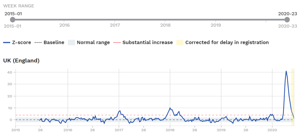
We we know at least some of this is lockdown-induced stress-caused deaths; we know from weekly reporting data that quite a few excess deaths are coronavirus-negative people too frightened by the media’s Corona drumbeat to seek treatment for health emergencies like heart attacks, stayed home, and died.
Here is a zoom-in on England for 2020:
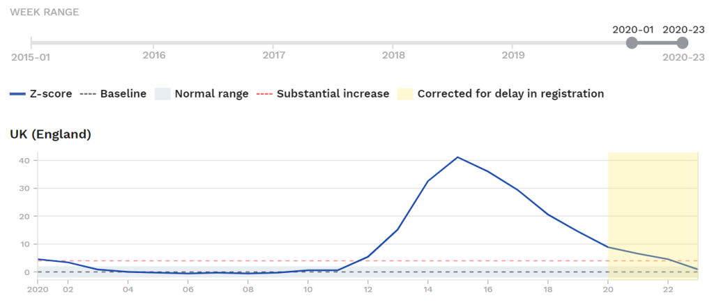
England shows a remarkable +214 z-score during the spike.
This is higher than any of the other countries reviewed and as an outlier requires explanation (see below, “Why is the excess mortality spike s much higher in England?”).
In England’s case, the 2017-18 flu spike amounts to +99 z-scores of excess (focusing on the spike period alone). Wuhan-Corona in 2020, at +214 z-scores, is therefore 2.16x worse than the 2017-18 flu spike in England. This is slightly less than the same figure for Belgium.
(See the final section for a summary of the magnitudes of all-cause-mortality excesses in the reviewed countries, compared to their own mortality-excesses in a late-2010s flu spike, and to see how England’s 2.6x compares.)
Why is the excess mortality spike so much higher in England?
For one thing, it could signal be a problem in the EuroMOMO internal calculations of how they calculated z-scores in England’s case. If this is the case, it should still at least by internally consistent, by which I mean we can still compare periods within England’s dataset to themselves, even if international comparisons may be off.
Second, Low Mortality preceding Corona for two years. We see a period of two full years with no period of excess (March 2018 to mid-March 2020; see first graph). The 2018-19 and 2019-20 seasons were very mild. When a sustained period with flu-spikes occurs, we would expect the next flu-spike to be higher. This is also observed in many other European countries in this study, and creates a modest upwards pressure on any peak-flu-event.
Third, Panic-Deaths. The lockdown in England appears to have triggered many Panic-induced deaths. There are several ways to calculate the magnitude of Panic-induced (vs. virus-caused) deaths, but this study provides another possibility: England’s z-score excess, as calculated by EuroMOMO, amounts to double the average for Spain (+177 z-scores), Netherlands (+107 z-scores), Belgium (+110 z-scores), Italy (+89 z-scores), and Sweden (+87 z-scores) — the average for these five is +114 z-scores. England’s (+214) is 2x this five-country average, and 2.5x that of Stay-Open/No-Lockdown Sweden.
The phenomenon of Panic Deaths will also apply to some of these countries, too, pushing the total magnitude of excess deaths attributable to the virus down somewhat. Figuring out the magnitude would require much digging through individual Health Ministry databases, and everyone reports differently. The beauty of using Total Mortality is it is a solid number. A dead body is a dead body.
From what we have seen, excess deaths during the mid-March to late May 2020 period could be as much as this in England:
- ca. +114 z-scores of Virus Deaths — excess associated with the virus, pushing a small number of the elderly and ill to death,
- ca. +100 z-scores of Panic Deaths — excess deaths induced by the lockdown, attributable to the response to the virus; those too frightened to seek medical care for serious, non-Corona problems.
If this is right, it puts coroanvirus-associated excess mortality in 2020 at no more than 1.4x that of England’s highest flu wave of the 2010s, which is in line with many other countries.
Some of the virus-caused deaths were to people very ill to begin with, which will cause the inevitable below-average mortality period coming in the summer, “canceling out” some of the excess.
Finally, a longer time horizon would also help. This study is highly self-limiting in that we only have data from mid-2015, or five winter seasons. A longer time hirozin would show other peak-flu-events in England of comparable scale:
As you can see, the biggest flu spike of the 2010s in England was the 2014-15 season, which unfortunately falls just outside the data range for the EuroMOMO dataset. Digging through the British Health Ministry’s website the full dataset should be able to be found but I will leave that to others.
Several spikes in the late 1990s appear to exceed the peak reached in 2020 (Week 15).
_________________
Next we can look at Scotland:
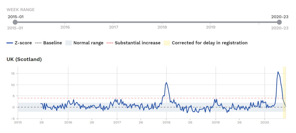
We see the coronavirus-period-associated excess is high but somewhat narrower. The 2020 spike is at +89 z-scores of excess (2020 Week 12 to Week 22).
The 2017-18 spike meanwhile had +80 z-scores of excess (2017 Week 46 to 2018 Week 11).
The 2020 coroanvirus-associated spike in Scotland is 1.1x as large as therecent-high (late 2010s) peak-flu-spike level.
‘Corona’ in Scotland is thus just about the same as a totally-ignored flu wave two years earlier.
(See the final section for a summary of the magnitudes of all-cause-mortality excesses in the reviewed countries, compared to their own mortality-excesses in a late-2010s flu spike, and to see how Scotland’ 1.1x compares.)
Here is the zoom-in on 2020 for Scotland:

Here we see Scotland breaking above the Substantial Increase threshold from Week 13 (March 22 to 28), in steady and strong decline by Week 17 (starts April 19), and returning back below this threshold as of Week 20 (May 10 to 16).
Scotland and England rise and peak at the same time, but England’s spike is higher and stays higher, longer. We already see signs of imminent below-average mortality in Scotland, perhaps starting in Week 24. This will not be certain until the July 2 or July 9 updates.
_________________
Next we can look at Wales:
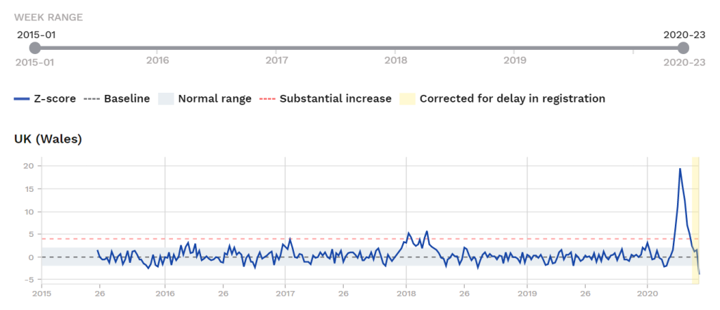
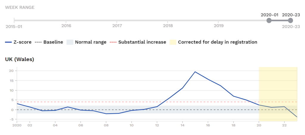
The 2020 spike amounts to +83 z-scores of excess (Weeks 12 to 22) and by Week 23 may already be in deficit (though this is highly preliminary, subject to revision).
The winter flu spike in Wales in 2017-18 amounted to +52 z-scores (2017 Week 50 to 2018 Week 15).
Wuhan-Corona in Wales is therefore associated with a death excess that reached 1.6x as high in total excess mortality as a winter flu spike in 2017-18 (with caveats similar to those of England on the role of Panic-caused deaths here, too).
(See the final section for a summary of the magnitudes of all-cause-mortality excesses in the reviewed countries, compared to their own mortality-excesses in a late-2010s flu spike, and to see how Wales’ 1.6x compares.)
_________________
Finally, Northern Ireland:

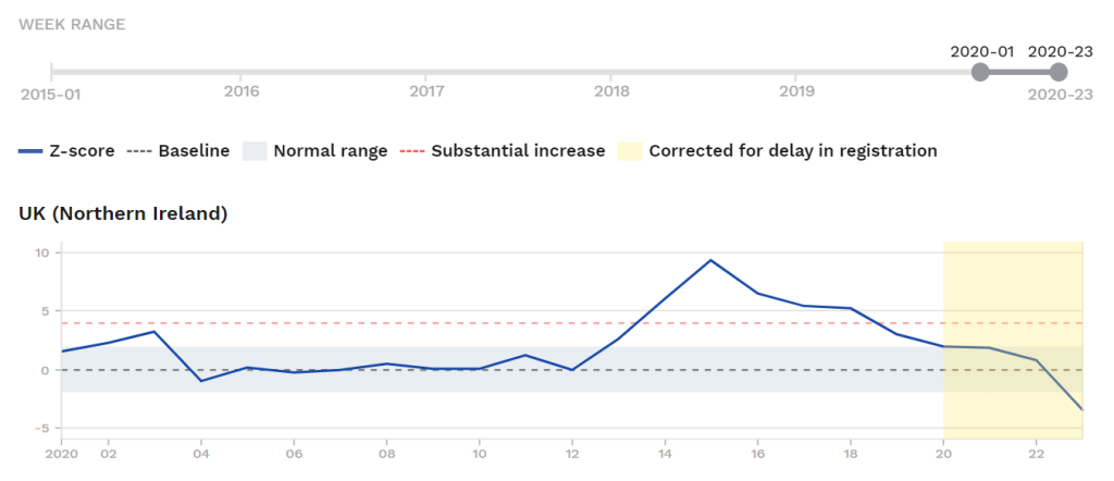
As with Scotland, we see excess mortality associated with the Wuhan-Corona period, but it is about on the same level as the 2017-18 winter spike.
In the 2020 spike, we see +42 z-scores of excess.
In the 2017-18 spike, we see +60 z-scores of mortality excess (2017 Week 47 to 2018 Week 14).
This means Wuhan-Corona in Northern Ireland was milder than the normal flu season of 2017-18, with the 2020 spike coming in at 0.7x the 2017-18 flu wave.
(See the final section for a summary of the magnitudes of all-cause-mortality excesses in the reviewed countries, compared to their own mortality-excesses in a late-2010s flu spike, and to see how Northern Ireland’s 0.7x compares.)
We also observe what looks to be possible mortality deficit already by Week 23, but we will have to wait a few weeks to confirm this.
________________
Summary of Findings: The Magnitude of Mortality Excess in Europe’s 2020 Spikes vs. Peak Flu-Spikes of the Late 2010s
We have seen that Austria, Berlin, Denmark, Estonia, Finland, Greece, Hesse, Hungary, Malta, and Norway were all very mildly impacted by the Wuhan-Coronavirus as seen in total mortality such that it either does not show up at all or is as a minor wave which would be ignored in normal times.
We have seen that France, Ireland, Luxembourg, Netherlands, Portugal, Switzerland, Scotland, Northern Ireland, show moderate impact.
We have seen that there is a significant rise in total mortality modestly higher than flu waves of the late 2010s in Belgium, England, Italy, Spain, Sweden, Wales.
In the countries that showed significant mortality excess, none towered over their own peak flu spikes of the late 2010s (to say nothing of a longer time horizon like back to 1990).
Here are the “scores” for the affected countries which showed any excess at all (Groups 2, 3, and 4). These total-excesses (measured in z-scores) are all subject to downward revision given coming sustained below-average mortality in mid-year 2020, which is already occurring in some places but will likely occur in all in the summer.
- AUSTRIA: +10 z-scores of aggregate mortality excess during its 2020 coronavirus-associated spike; 0.15x its own top flu wave of the late-2010s.
- BELGIUM: +110 z-scores of aggregate mortality excess during its 2020 coronavirus-associated spike; 2.3x its own top flu wave of the late-2010s.
- ENGLAND: +214 z-scores of aggregate mortality excess during its 2020 coronavirus-associated spike; 2.16x its own top flu wave of the late-2010s.
- FINLAND: +10 z-scores of aggregate mortality excess during its 2020 coronavirus-associated spike; 0.5x its own top flu wave of the late-2010s.
- FRANCE: +84 z-scores of aggregate mortality excess during its 2020 coronavirus-associated spike; 1.2x its own top flu wave of the late-2010s.
- HESSE (Germany): +7 z-scores of aggregate mortality excess during its 2020 coronavirus-associated spike; 0.1x its own top flu wave of the late-2010s.
- IRELAND: +29 z-scores of aggregate mortality excess during its 2020 coronavirus-associated spike; 0.5x its own top flu wave of the late-2010s.
- ITALY: +89 z-scores of aggregate mortality excess during its 2020 coronavirus-associated spike; 1.75x its own top flu wave of the late-2010s.
- LUXEMBOURG: +8 z-scores of aggregate mortality excess during its 2020 coronavirus-associated spike; 0.47x its own top flu wave of the late-2010s.
- MALTA: +12 z-scores of aggregate mortality excess during its 2020 coronavirus-associated spike; 0.35x its own top flu wave of the late-2010s.
- NORTHERN IRELAND: +142 z-scores of aggregate mortality excess during its 2020 coronavirus-associated spike; 0.7x its own top flu wave of the late-2010s.
- NETHERLANDS: +102 z-scores of aggregate mortality excess during its 2020 coronavirus-associated spike; 1.3x its own top flu wave of the late-2010s.
- PORTUGAL: +127 z-scores of aggregate mortality excess during its 2020 coronavirus-associated spike; 0.2x its own top flu wave of the late-2010s.
- SCOTLAND: +189 z-scores of aggregate mortality excess during its 2020 coronavirus-associated spike; 1.1x its own top flu wave of the late-2010s.
- SPAIN: +177 z-scores of aggregate mortality excess during its 2020 coronavirus-associated spike; 1.38x its own top flu wave of the late-2010s.
- SWEDEN: +87 z-scores of aggregate mortality excess during its 2020 coronavirus-associated spike; 2.07x its own top flu wave of the late-2010s.
- SWITZERLAND: +75 z-scores of aggregate mortality excess during its 2020 coronavirus-associated spike; 0.5x its own top fly wave of the late -2010s.
- WALES: +83 z-scores of aggregate mortality excess during its 2020 coronavirus-associated spike; 1.6x its own top fly wave of the late -2010s.
Grand Total Average Magnitudes
The average for the eighteen countries that exceeded the normal range in mortality and saw some kind of discernible “spike” in March to May 2020 (Groups 2 to 4 in this post, listed directly above):
- 1.02x greater mortality excess from the 2020 coronavirus against their own 2010s-era flu spikes (i.e., for every 100 excess deaths during these countries’ highest late-2010s flu spike, the 2020 spike had 102 excess deaths.)
It is reasonable to say this number (exact parity with 2010s-era flu spikes) is too low because there was a significant “lockdown” effect in some countries.
Taking the average among the most-affected (large-spike countries only (Group 4: Belgium, England, Italy, Netherlands, Spain, Sweden, Switzerland), we get:
- 1.64x greater mortality excess from the 2020 coronavirus against their own 2010s-era flu spikes (i.e., for every 100 excess deaths during these countries’ highest late-2010s flu spike, the 2020 spike had 164 excess deaths.)
In other words, even for the seven countries most affected, the Wuhan-Coronavirus only modestly exceeded the recent peak-flu magnitude. It may not exceed several big ones of the 1990s.
This 1.64x number includes all deaths, and therefore includes cases of known Lockdown-induced (non-virus) excess deaths, known to be significant in England at the least, and with indications of the same out of Belgium, partially explaining the large excesses outlier status of those two countries.
Correcting for these Panic-induced deaths, the real magnitude may be in the 1.3x to 1.5x range. In any case, to revive a phrase, it looks like Just The Flu.
_________________
Final Thoughts: The Lockdown Big Mistake at Three Months
We have concluded that the Wuhan-Coronavirus may be around 1.3x as bad as normal peak-flu events, based on all-cause mortality data in Europe across a variety of countries with a variety of epidemic-management strategies.
It amounts to being, as Dr. Wittkowski said, just like all other flu viruses, maybe a little worse. (We can now prove it with final data; Wittkowski proved it with early data and his expertise already in late March, which is why he is the world-renowned epidemiologist while the Panic-pusher ringleaders are just digital lynch-mobbers.)
The Purpose of this Study
It’s worth remembering what the purpose of this and other studies like it is. Even more broadly: It’s worth remembering what the purpose of a society or a state is, or in this case better stated as what the purpose is surely not: The purpose of a state is not a mad-dash, all-out-effort to suppress/minimize flu deaths at any cost. The very suggestion is, of course, absurd. Some people became so narrowly focused on this that it looked like they did think this was exactly the purpose of the state.
Something as extreme and reckless as society-wide shutdowns, lockdowns, and a top-down Panic about a flu virus requires a very, very high standard indeed (maybe on the level of uncontrolled Ebola). The Wuhan-Coronavirus simply never came close, gut-feelings by Panickers do not count. The Panic created a disaster, as panics tend to — which is why sane public policy works all out to avoid Panics.
If a country has 7,000 die in a moderate flu year, then 10,000 in a bad flu year in (say) 2018, then in 2020 is faced with 13,000 dying of flu, “locking down” society is obviously crazy. Actions have consequences, and shutdowns do real (and unnecessary) damage. The lynch-mobs of social media may not “get” that extreme actions have consequences, the Lockdown-fanatics who say “We have to do all we can to save every life!” may not get it, but reality remains.
I still believe this will all be remembered, in due time, as irresponsible, reckless, and really a discredit to our civilization as it existed by the 2010s, immediately pre-Corona. From a distance (of time) it will symbolize a sickness in our culture, a line of thought which goes back into territory I tried to explore in Part XII (“Is Corona a Religious Cult?”)
Let’s recall that the justification for the sensationalized, media-directed Panic, and then the shutdowns/lockdown, was (at least in the early stages while they still felt the need to justify it): It’s a “new!” virus. Alarmingly dangerous! If it starts spreading here, it’ll be an apocalypse on never-before-seen scale! “25x, or maybe 50x as dangerous as the normal flu, maybe more! Who knows! — No one’s ever seen anything like this!” “Swamped hospitals are inevitable!” “Millions could/will die!” (And so on.) The Panickers churned these things out daily. Panic Now and Don’t Look Back, was the message. Very many did.
The anti-Panic side argued that this loose talk was reckless and was poisoning the atmosphere. The vortex of Panic was almost certain to cause terrible, kneejerk decisions (the shutdowns/lockdowns) which would probably do far more harm than good (and/or were immoral and/or illegal).
One committed group on the anti-Panic side, which included top experts in the field, insisted that the projections of doom were probably all off by two orders of magnitude; rather than the media-pushed 3% fatality rate, it was probably more like 0.03% (now confirmed), and so on.
What I want to say here is that the exhaustive data I have presented here, collected after the end of the epidemic — i.e., on the far side of the “spikes,” if any, in every country in the dataset — was already foreseeable, in outline form, in March based on the early data and epidemiological expertise, at least to those who knew what they were looking for. It was clear from observed-data by no later than April 1, and was no longer disputable by mid-April; nothing like the projections of doom by the pro-Panic side was going to happen.
I cannot now remember when exactly I realized it was going to be a knockout win, on the data, for the anti-Panic side, but it was in March. Absolutely every data-set we have gotten has confirmed it, and we should have re-opened on Easter as Trump wanted (he had lost control of the government by this time, if he ever had it, to a defacto Corona Coup-D’Etat regime, or as I have called it, the Fauci Junta).
Now, it is true the pro-Panic side was always able to say, “It’s too risky; we have to wait and see.” The problem with that was/is, once you embrace that line, it’s not easy to let it go. In other words, Better-to-Play-it-Safe-ism, once unleashed, becomes itself like a virus which you cannot contain. Two weeks of wait-and-see shutdowns turned into Lockdown Forever demanded by a population that had converted to a religious cult.
The net harm from the lockdowns will be quantifiably hundreds of times worse than the virus itself in human-life terms; politically, force were unleashed that caused unpredictable but destabilizing and tragic outcomes including as the rise of a Red Guad-style Maoist race-cult, a rival cult to the Corona Cult itself but largely symbiotic with it.
We can now call but close the book on this: The anti-Panic side was right.
Nowhere did we see anything like a horror-movie virus-apocalypse, excluding the sensationalized pseudo-reality of the media and social-media; there are millions who still, I assume, believe an apocalypse either did occur or was very narrowly averted by heroic politicians and “front-liners.” Perhaps such people will never let it go. This post is meant for others, those who believe in evidence, and for the historical record.
______________________
Postscript.
This became a much longer post than I intended when I created the Berlin graphic on June 11. I eventually decided to integrate a full reporting on all twenty-four countries and the full lessons we can learn from all of them. I don’t know that anyone else is doing this work in this way, but it’s worth it. If I saw someone else had done it, I would not have.
I will return to this dataset, all-cause mortality in the 24 monitoring countries in Europe, on July 2 and Aug. 27, after the fresh updates of those weeks.
July 2 will bring the full/final data to early-mid-June, three more weeks past the data presented here; Aug. 27 will be an additional eight weeks and should cover most of the expected below-average mortality periods across all these countries.
The goal is to be able to check what patterns hold and the degree to which countries have entered below-average mortality. Especially of interest is Sweden, given that it avoided lockdown.
_____________________
[End.]


I was wondering when Part XIV would come out. I’ve been checking regularly, but I can see now why it’s been a while. You’ve spent a LOT of time on this post, Mr. Hail, with loads of great, easy-to-compare data. Thank you for the service you’ve done in convincing some, but also documenting this massive stupidity for forensic studies by historians, if any can survive this mess created.
That last part sounds hyperbolic, but let me write this same point I’ve made multiple times before. I don’t care if it had been the case that this Kung Flu virus HAD been 10 times deadlier than anything we’ve seen before. It is always the wrong thing to do to let the State exercise more power, because they feel very comfortable using it plenty more times. If this thing had been on the scale of the Black Plague, well, my State’s Governor wouldn’t have had to do anything, as my family would have bugged out to the country with a stash of food and water, or whatever else we could have thought of. People would have locked themselves down on their own.
BTW, I’ve been trying to avoid this topic on unz with my comments, as I haven’t seen any posts lately that are specifically on this topic. (I wonder why.) If I were to, I wonder if Mr. Unz would back off his panic-filled rhetoric finally. I know Mr. Sailer has been solidly back to his forte since at least the last couple of weeks. That’d be really refreshing, if the country being destroyed culturally weren’t the topic that we NEED to talk about now. Interesting times indeed …
It seems the US is an unserious country. “We” stumble from moral panic to moral panic, and many seem totally unaware. They think this is normal, this is how healthy societies function. They are wrong.
The moral panic that was the Corona-Panic (the influence of which remains, and the after-effects of which will loom large for a long time) caused the current maoist break with reality (which bizarrely features cheerleading by mega-corporations, celebrities, journalists, and etc.).
I have wondered if there might be a 2×2 box giving us four categories of person:
– Pro-CoronaPanic and Pro-RacismPanic
– Pro-CoronaPanic and Anti-RacismPanic
– Anti-CoronaPanic and Pro-RacismPanic
– Anti-CoronaPanic and Anti-RacismPanic
(for the Racism Panic, ‘Neutrals’ would be included in ‘Anti’ for purposes of the 2×2 box)
What I know is the first group, whether they believe all of what they say or not, run the show, have all the initiative, and are willing to do real damage. Generally speaking, they are the “regime.”
You’ve likely seen the handle “Citizen of a Silly Country”, from one of the better commenters on iSteve. (He used to comment there a lot more than he does now..) I have a series of posts coming with that title, as that, and what you wrote, nails it. I don’t think I want to be a part of a silly, unserious, country, eventually to be an Idiocracy.
A for the 4 possibilities, I guess the 2nd group would automatically be hypocrites. Could they not call for protests on Zoom only? How about “we are mad, but let’s wait until the vaccine to protest”?
I would say # 1 is the group that trusts the Lyin’ Press and mad twitterers the most. It’s leaders are, as you say, the current “regime” or Establishment.
#2 are they flat-out hypocrites, as I wrote, and the most lefty, anti-American of them all.
#3 sounds like it would have a lot of Conservative, Inc. types in it.
#4, well, we are the ones that are really awake.
The kinds of people who were in category 1 there (Pro-Panic during ‘Corona’ [Feb. to late May and continuing in modified form] and now also pro-Panic about ‘Racism’ [late May to present]), and the lockstep nature by which they formed and held ranks on both, brooking no dissent, suggests that both panics serve the interests of the state (or power-structure, or “regime”).
Do we have specific examples of “actively opposed to the Corona-Panic but actively embrace the Racism-Panic”?
One thing the two panics have in common is the complete defeat they suffer when held up the light of day, when evidence for/against is examined.
Both depend on quasi-religious, even magical thinking, and emotion; both depend on what is effectively a huge, coordinated campaign of propaganda.
The racism panic of course has a longer tradition of exactly that sort of thing in the US (and since exported all over the West). “It’s real, even though you can’t see it, or prove it, even though it is unfalsifiable. Believe or or face the consequences.”
Now the media is laying the groundwork for lockdown II. Our elites just want to flex and punish the plebes for voting for the wrong guy.
In agreement with spirit of your comment re: the role of the “elite” or as we might call it, the “regime.”
I had wanted to write a post outlining the Corona Coup d’Etat concept I have often referenced, but never got around to it. The rise of Red Guard-style “psychotic break from reality” movement(s), aggressively promoted by the “regime” despite the bizarre detachment from both reality and common decency — and which are clearly induced by the Lockdown (we warned them) (See Part XIII), are now part of this.
I will add this: The Corona-Coup-d’Etat is not as simple a story as “the US media hates Trump and so promoted the virus” (though that is an undeniable part and also ought not be neglected).
Why did the Europeans mainly fall for it?
Some of these countries in Europe made moves to lock down before it was clear the US had caved into the Panic, and none of them for the kinds of political aims comparable to “discrediting Trump.” In fact, the opposite seems mostly to be the case: Ruling parties seem to have benefited from the crisis. The Merkel government’s ruling party in Germany regained footing in the polls unseen in several years at the expense of right-wing dissident parties. Viktor Orban was literally granted dictatorial rule by his parliament for the duration of the crisis as he sees it.
To extend the scope of my own question, the European may have “fallen for it,” but they also shows signs of having snapped out of it sooner. In some of this very long post, examining the timing and magnitude of this flu virus’ “hit” in different countries (as seen in all-cause mortality data for the now-complete epidemic arcs), I included brief remarks on responses, including when countries began lifting lockdowns and making moves to re-open, after seeing the sustained fall of the Deaths curve. The US, despite seeing the same patterns at the same time, still urged people Don’t Give up the Panic, and kept in draconian and unprecedented shutdowns. (See the final section of the Portugal entry and Spain.)
It’s clear from the case of Denmark and the Prime Minister’s admission that she panicked and made a mistake in ordering the lockdown, that the Corona-Coup and Corona-Cult dynamics were both strong.
in the case of ireland, we had an election in february that the ruling party lost comprehensively and a radical party beat the other mainstream party into second place! the lockdown allowed the losing party to rule until yesterday (june 26), made the party leader a “hero” and allowed the 2 main parties go into coalition “for the good of the country” with the fig-leaf of a thoroughly discredited green party so it doesn’t look like business as usual!
That sounds about right for Corona-Politics.
People flock to the arms of the local regime. A classic “crisis” or even “coup d’etat” dynamic, observable in many cases. In retrospect it won’t be hard to see the motivation from the political end to push the Virus Panic.
Why do you think China made such a fuss in the first place? As far as I can see, rather than trying to cover it up, the Chinese (or at least the South China Morning Post, based in Hong Kong or the CNA based in Singapore) were sending out creepy reports about a mystery illness in Wuhan several days before anybody died.
This is a great question to ask.
In comment sections here since April, some ideas have been proposed. I have been meaning to do a post on it. The critical decision was the crazy Lockdown of Wuhan decision, which was a terrible mistake.
I see four possibilities. The full explanation might include some degree of each of these, but maybe one is the dominant explanation.
1- The CCP itself panicked and overreacted;
2- The CCP exaggerated to show strength to a domestic audience, and ramped up the extreme public-health theater on very thin evidence. Policy-makers knew it was a dud as far as killer-viruses go but that a strong show of force would look good for domestic purposes (there were then copycat versions of this across the world in coming months and to the present — Corona-Demagogues galore);
3- The CCP believed unrelated, structural economic problems of major scale were imminent and grabbed the virus crisis narrative to preempt the coming economic problems in public eye. Amid all the confusion and chaos, people would blame the Virus (which China heroically overcame through strong CCP leadership!) and not the system.
4- The CCP deliberately exaggerated, lied, to scare the West. Their wacko Wuhan Lockdown decision was entirely cynical and meant to frighten the US and the West; the imagery would scare people into believing the virus was a major threat (when the evidence was never there, and, by April, was thoroughly disproven).
There is an inevtiable international component here. The CCP knew the virus would spread and that, as of 2020, the world has the means to track flu viruses in real time and has saturation-level media coverage potential — the Panic-Pandemic was already kind of a fact long before the virus, just look at the US news-cycles in the late 2010s.
If (4) were the prime motivation here, it was a madman’s gamble. A major attack on the West, which would necessitate no bombs or missiles on either side but deal war-like damage to the West, all self-inflicted.
Another possibility, which could be linked to any of the above, is that the virus was a man-made or at least man-altered coronavirus which somehow got out of the lab in Wuhan where coronaviruses are studied. Various researchers (Dolores Cahill, Alexandra Henrion-Caude) have pointed out that there is a section in the genome which is very unlikely to have come about naturally. They aren’t suggesting anything as sinister as a bioweapon, just that even in a high security lab mistakes can be made. That might explain the panic. Meantime, what has the PRC been up to while everyone’s eye has been off the ball?
None of this excellent, well-reasoned and “data-ed” post matters- the cultists are still in control, and show no signs of loosening their grip. Here in Massachusetts, no kids’ summer camps, no open bars and restaurants, masks everywhere, Karens calling the cops on fellow citizens, no rakes in the bleeping sand traps, as well as those stupid foam things in the cups…
We are in the grip of a madness I have never seen- why?
I agree with what you say.
The “emperor has no clothes” idea comes to mind but it’s not quite right. The skilled use of propaganda by the Corona-Cult and Corona-Coup people has successfully created a pseudo-reality of a great crisis, when it really was a bad flu spike not unlike many others we have all lived through.
By the way, a stray article from April 2012: Is media-driven ‘pseudo-reality’ the future of U.S. politics? The answer to that, eight years later, we can say is YES. There are glaring examples from the past few years, even the past few days.
Presenting the truth/reality as best as can be done is still worth it, for its own sake.
The final section of this post was updated/expanded with general thoughts in light of the definitive proof now from observed data that the pro-Panic side was wrong in its loose apocalyptic talk.
Someone asked about cumulative deaths for Sweden:
The period before the Wuhan-Corona flu wave was running below-average for deaths (2019 a very mild year), as you can see in the graph (and as discussed in the main post Sweden section).
For the fifty-two weeks up to 2020 Week 21, Sweden stands at +66 z-scores of excess mortality, or +1.3 z for the entire (year, 52-week) period taken as a whole. This is in the normal range (-2 to +2). Sweden is going to start showing a mortality deficit starting Week 25 or 26, I think, and probably many/most weeks in coming months, and some of that will be “cancelled out.”
I’m now getting “OMG! Look at the spikes in Texas, Florida, Arizona! Any thoughts on how to answer, or is it pointless. BTW my prediction is normal school will NOT open in the fall.
It always helps to work with a full set of numbers rather than a single soundbite-type scare-line (“Cases rising!!”):
Texas has had very few deaths per capita, in fact less than one-fifth Sweden’s per capita level. We would expect it to eventually rise to normal levels.
Doesn’t anyone still pushing panic in June remember the March and into April slogan “Flatten the Curve”? Haven’t heard that in a while. Was the strategy abandoned in favor of “endless, pointless, forever-war against a flu virus”?
Flu viruses always circulate, and a mad-dash to stop them from circulating is the height of folly, something like Don Quixote attacking his windmills. The good news is, unless we were terrified of flu before, we ought not be now. No evidence suggests it is much more dangerous than any ‘usual’ bad flu strain.
(This is how I might respond if the person was receptive.)
Thks
Hail, During February I was wearing a N95 mask. The early exponential increase in deaths in Italy scared me. By the 3rd week of March I saw enough data to realize the media narrative was a lie. I live in Virginia under a lock-down and mandatory mask wearing in public- two months after the peak in Covid19 deaths. This is madness. Thank you for the massive work you are doing to expose the lies.
Thanks, RVS, for your comment.
In Virginia’s case, while it’s easy to see the reason for the kneejerk lockdown decision (notable would have been had there been a case of a major state governor rejecting the Panic cycle outright), it’s even easier to see why the Virginia governor Ralph Northam continued it as long as he has, against all logic. (Several European countries reviewed here follow almost exactly the same epidemic arc as Virginia and all proceeded on swift re-opening paths by early May.)
The decision there is obviously political. Northam himself faced a real crisis and threat to his rule and that of the ascendant coalition he represents, including the January 20 rally against Northam in Richmond. There was serious talk by many counties of holding a referendum to leave Virginia and join West Virginia ongoing by Dec. 2019 and into the new year. Any leader in such a position would chomp at the bit to “lock down” under any guise.
Hail, I have done a simple analysis that I think proves that lock-downs did not slow the spread of Covid19. I have been posting it at sites that continue that claim that Sweden’s policy was wrong. You might include it in a posting if you find it useful. I have not seen this logic presented anywhere else:
An inspection of the epidemic data shows that lockdown, masks, and social distancing do not reduce the spread of Covid19.
If lockdowns, masks, and social distancing were effective at slowing the spread of the disease, it should take longer to reach a peak in deaths for a country that imposed these mitigation factors compared to a country that did not. Mark the start of the epidemic in a country as the date when an arbitrary percentage of its residents have died of the disease because death statistics are more accurate than case totals or hospitalizations.
Now apply this metric to UK and Sweden. The UK imposed a lockdown on March 24. Sweden did not impose a lockdown. Schools (under 16 yo), businesses, bars, and restaurants stayed open in Sweden, but people were encouraged to practice personal mitigation so as to not overwhelm the medical system.
According to Worldometers on March 18th a total of 10 people had died in Sweden of Covid19. Since UK has roughly 6.6x greater population, UK’s comparable milestone was reached on March 16th when a total of 65 people had died.
UK and Sweden both experienced a peak in Covid19 deaths on the same day- April 21. The deaths on that day were 1172, and 185, respectively.
UK went from 65 deaths to a daily death peak in 34 days, Sweden from 10 deaths to a daily peak in 32 days. At best UK’s mitigation bought two days of delay in the peak of the epidemic.
Mitigation had no significant effect on reducing the community spread of Covid19 in the UK.
Furthermore, since mitigation does not reduce community spread, it does not save lives. Each person who is exposed to the disease has a probability of infection, hospitalization, and death. That chain of events begins when a person is exposed, which is determined by the community spread rate. So long as the medical system is not saturated, the death rate is largely determined by the susceptibility of the population to the disease. The only thing that can save susceptible people is they isolate themselves while the unsusceptible people acquire herd immunity. Then it would be safe for the susceptible to emerge from isolation.
Sweden’s death rate is relatively high because it houses susceptible people in large population nursing homes. (but low compared to the doomsday predictions in March) If one case of Covid19 enters the home, all the susceptible people in the home die. The death rate in New York was especially high because the state forced over 4000 Covid19 positive patients into its nursing homes.
The US also reached a peak in daily deaths on April 21st with 2693. Hence the community spread in the US was similar to the spread in the UK and Sweden. Daily deaths are now below 800. The death rate to date is 365 per million. That is less than one person in a thousand dying. Daily deaths are following Farr’s law of epidemics, with a long tail. The remaining susceptible people increasingly are facing less risk because the population is nearing herd immunity. The epidemic is nearly over in the United States.
Thanks — Your points are correct on the lockdowns. I’d add there are many cases of specific places in the USA that show the same per capita death rate and a very similar epidemic curves as Sweden. This applies to the Washington DC area, despite the lockdown severely disrupting life, the total of corona-positive deaths is identical to Sweden’s. What was the lockdown for?
Knut Wittkowski, one of the world’s top epidemeologists, was beating this drum as early as April 1, seeing the classic patterns in the early data. He got millions of views in his interviews on Youtube until Youtube banned them for “violating the guidelines of the CDC.”
______________
A technical point: WorldoMeters does not report the correct daily deaths for Sweden, resulting in “reporting date” being confused with “death date.” There was never any day with anything close to 185 deaths in Sweden; April 21 was actually well along on the down-slope and had 77 deaths.
See this table for the summary of daily deaths pegged to date of death and not date of reporting:
The peak in Sweden by one measure (smoothed rolling avereage) was April 6 to 17.
(See also the two graphs: Deaths and ICU-Intakes, and Sweden Reality vs. Ferguson predictions.) (I was going to update these with a June 19 update, but Sweden seems to have not updated that day or today, I think in line with the Summer Solstice, which is today.)
The lockdowns not being effective is also the same finding of this post’s approach, all-cause mortality — which is as one would expect with an already-circulating respiratory virus, if the experts had been consulted, they’d have told you that; instead, extremists were empowered and a Panic cycle broke through.
Even in cases where lockdowns seem to have been effective (the most lightly affected countries in this study that show minimal or no all-cause mortality spikes), there is the problem of the population not getting immunity, perhaps guaranteeing second waves.
Also see the final section of this post: Life is not “a game of all-out suppression of flu viruses at any cost,” and the hyper-focus on the virus during Peak Corona-Panic made some lose sight of that.
The point of saying this is to highlight that the lockdowns themselves had major negative consequences. In the cases of England and NYC, we have evidence suggesting more people died, even in the immediate term, from the effects of the lockdown than from the effects of the virus itself. (Many more worse-life-outcomes and earlier deaths, some harder to quantify than others, will follow from the lockdown decision.) Whatever the true number of Lockdown-induced vs. Virus-caused deaths, the two numbers are comparable in the peak places.
The lockdowns were a public policy disaster and will be studied for years and years, taught in textbooks as an example of what not to do.
I appreciate your correction that WorldoMeters does not report daily deaths correctly. Is there a website that does report daily deaths accurately for Europe and North America? I want to get my numbers right, yet reference a database anyone can access to double check for himself.
In Sweden’s case, the Swedish Public Health Agency (Folkhalsomyndigheten) updates its database daily at 2pm Swedish time, though holiday and weekend updates are minimal. The graphs posted above are sourced directly from there. Their database is at:
https://experience.arcgis.com/experience/09f821667ce64bf7be6f9f87457ed9aa
Avlidna: Deaths
Intensivvårdade: ICU-Intakes
As long as the daily average stays below about 35 for the week, it seems Sweden is in the normal range.
Another brief point on Sweden:
Stockholm still has 3x the coronavirus-positive pera capita death rate as the rest of Sweden. This reflects the widely reported collapse of nursing home protocol; nursing homes staffed entirely by refugees in Stockholm failed to follow flu epidemic rules in March and were hit. Nursing homes in other regions did better. These deaths are reflected in the little “hat” in the Deaths curve you see from April 5 to 19.
(Swedish policy has been to bring in refugees, but they have nothing to do, no Swedish, and often limited skills; a million have been brought in since 2010; the official explanation given is there were widespread failures to properly understand government communiques in Swedish by these staff in Stockholm nursing homes.)
Here is the All-Cause Mortality spike for Sweden:
I wonder how much different a graph for Sweden Without Stockholm would look.
Firstly thank you for this work.
After reading and understanding these kind of imformations i clearly see that this care home deaths in eu and usa and canada looks awfully like deliberate works. DNR forms, sending back frails to care homes, shoving tubes down people’s throats before adressing less invasive techniques…i don’t think it’s incompetence at all
I don’t think the nursing home deaths were deliberate. But, in a perverse sense, they were effectively celebrated by the media:
“The prophecies are coming true! We were right! Panic NOW! Submit to us, your guardians in the media and the regime under the Fauci junta.”
No, media and hardline pro-Panickers. The prophecies of mass doom were always wrong. Nursing homes were hit hard in some places, which — ironically — was something almost guaranteed by the Shutdown and Lockdown policies. They prolonged Panic and lockdowns disrupted the time-honored herd immunity mechanism from functioning. Governments and nursing home staff often failed to protect them with normal flu epidemic procedures, with again decision-making seemingly distorted by the Panic in March.
In other words, the media is responsible for some of these deaths, by promoting the Panic.
Continuing madness- Bowdoin College has announced no fall sports. It’s athletic conference, NESCAC, Is one of the premier DIII college conferences in the countjry, so Iexpect other NESCAC schools (Amherst, Williams, Wesleyan, etc) to follow suit. I also believe they’re only bringing two classes to campus.
I’d say the only way to understand the rejection of evidence, rejection of common sense, and extended boycott of cost-benefit analysis that would lead colleges to majorly disrupt their operations over this of-interest-to-specialists-but-otherwise-unremarkable flu virus is…. Corona as religious cult.
Yup
WSJ today has an article about making masks mandatory nationwide: “As coronavirus cases surge around the US following reopenings in numerous states, public health experts and many in the broader public consider face coverings essential measures to slow though spread of the new coronavirus “
I gained respect for the Wall Street Journal during the height of the Corona-Panic as one of the few places that did not cave in to the Panic completely, and actively held the anti-Panic flag.
The article you refer to appears to be a concession to the Cult. The Wall Street Journal is of course editorially in favor of business and free-market-ism, and during the height of the Panic they knew a full victory by the pro-Panic side (which is what happened) would devastate the economy. Now they, and many others, realize they must accommodate the cult. But the point is still to support the interests of business and economic productivity.
Here is the opening to that June 22 article:
I wonder what a full review of Corona material on the WSJ editorial page for the full months of March, April, May, and June would tell us about the status and fighting spirit of the anti-Panic side.
Great report Hail.
One thing I must emphasize is that it simply is not the case that these death numbers, these spikes, can even be considered “Covid deaths” as we reference those deaths from nursing homes. Those deaths, for the most part, WERE NOT “Covid deaths” they were deaths directly caused by administrative euthanasia. Whatever that number may be, and it is substantial, tale that out of your equations and we will find that Covid was “not even the flu.”
And this is vital to the understanding of what has just happened and why the bulk death rate. Once this is pointed out the entire narrative falls apart. Add to it that, at least here in the US, horrendous protocols were used in hospitals which certainly did kill many who would still be alive today. Take those out of the equation and the “Covid death” numbers shrink even further.
And then there are these two problems to further refute the entire Covid narrative:
Click to access CoronavirusPanic.pdf
Allen,
To attach numbers to your point, it looks like the final corona-positive death count for Sweden will be:
– 4,300 nursing home residents
– 1,450 people not living in nursing homes
(The country of most interest remains Sweden, because it didn’t do any shutdowns.)
That’s 75% of all the corona-positive deaths being nursing home residents. (This fact alone immediately casts major doubt on the central premise of the pro-Panic side.)
The 4,300 nursing homes deaths are higher than it needed to have been (there as in other places); there were systematic failures, and basic peak-flu-season measures were not observed in some nursing homes in Stockholm, plus the Panic (not unfelt even in Sweden) led hospitals in many places, early on, to “over-correct” with treatments that may have resulted in more deaths, as you suggest. In any case, Stockholm’s nursing homes alone account for as much as 40% of those nursing home deaths (Stockholm has 20% of the national population).
Once a person checks into a nursing home, he or she is on a limited life expectancy anyway, of course, and these 4,300 nursing home deaths occurring in Q2 of 2020 will result in downward pressure on mortality in Q3. I expect below-average mortality in the coming weeks and months in Sweden.
They have been back below the Substantial Increase range, now, for over a month. None of the five weeks since late May will show them above that threshold again. I think either Week 25 or 26 will put them back in the normal range in EuroMOMO system.
What about those 1,450 non-nursing-home deaths? Some are also going to be “deaths with the virus who were dying anyway,” as we know. In simple terms, the chance of a non-nursing-home resident dying in 2020 positive for coronavirus appears to be about 1-in-10,000. This appears to be about the risk of dying in a car accident per year for Swedes who drive cars.
Hail,
Have you seen any studies from NYC that cite the demographics of those who died from “Covid” as relates to income levels?
I live in NY State. Where I live there is a fairly high ratio of elderly and those elderly are in what you might call “high end” nursing homes- though they are called “retirement communities.” We have had exactly zero deaths, hardly any cases and few hospitalizations. I need to add that we also have an extremely high ratio of foreign nationals from China- students. I’m guessing if calculated maybe the highest in the entire country per capita. We also have an extraordinarily high ratio of students from NYC coming and going. Add to that that I know from first hand experience that these three sub-groups constantly interact at the Universities. How is it no deaths, and hardly any, if any, infections?
Well I think that comes down to the socioeconomic status of these elderly which allows them to maintain their overall health and well-being moreso than those in NYC that ended up getting butchered at Elmhurst hospital for example.
Now we go to the county right next door and they have had 21 “Covid deaths.” 20 of the 21 deaths came from the same nursing home. Information on the single death not at the nursing home has not been released. This county is much poorer and that nursing home as it turns out has had numerous previous violations for unsanitary conditions. Not too difficult to understand how any infectious agent would impact those who are vulnerable in an unsanitary place. I don’t know specifics on if the care at that home became worse during the Covid panic due to workers not going in or if they too followed policies that caused these deaths. That has been the pattern though throughout NYC and elsewhere.
I’m not aware of any income status of coronavirus-positive deaths, and I wonder even if we had zip code data how much tthat would mean given that the large majority of the deaths are to retired people whose zip-code residence at time of death, one way or another and by merit of their being in retirement, may not reflect their socioeconomic status.
Everything you write sounds correct. But alas there is no story there, because we already knew the poor (unfortunately) have worse health outcomes than the rich. That’s a Dog Bites Man story, if ever there was one!
To me, the bigger story in New York City remains the (not much talked about; never by the media) large number of coronavirus-negative excess deaths. They are Lockdown-stress-induced, Panic-induced deaths. The mechanism by which these thousands of deaths occurred overlaps with the nursing home deaths.
The same phenomenon, of significant numbers of the excess deaths during the Corona-Panic/Lockdown period having no ties at all to the Wuhan-Coronavirus and thousands more dying than usual despite being corona-negative, was observed and documented in several large cities in Europe, notably London. When you correct for their lockdown-induced deaths and the breakdown in nursing home protocol deaths, in “peak panic” places like NYC and London, the magnitude of all-cause mortality goes down to within the strong flu range, in line with other places. If 100 is the number of excess deaths from a peak flu season of the 2010s, Wuhan-Corona’s measurable hit after these corrections generally seems to no more than 150, some places even less.
Here is how it looks in practice:
The baseline mortality for late January to mid-June is 22,000. New York City has logged 47,000 deaths. (It would help to have a longer time-window to judge how much of a long-run excess this is, similar to the EuroMOMO series used in this effort; in most of Europe we see remarkably mild 2018-19 and 2019-20 seasons in succession, which cancel out some of the spike alone.) (Also, it would be of use to wait to see the magnitude of below-average mortality, which is imminent given who has died during the flu spike.) 22k baseline and 47k actual leaves 25,000 excess deaths.
NYC/CDC’s data suggests, by my count,that at least 7,000 are corona-negative excess deaths (including, early reports suggest, hundreds of Lockdown-induced excess suicides) and 9,000 are nursing home excess deaths (nursing home patients who weren’t already dying).
Without the lockdown and media-directed Panic, that “7,000” would be “0.” (These are Panic-induced deaths by people who had some non-corona medical emergency, especially heart attack, but were too scared to seek treatment for fear of hospitals; well documented).
With a better response strategy on the Wittkowski model — no lockdown, normal measures for nursing homes carried out responsibly — the 9,000 nursing home deaths would also be fewer, to some degree. The ordering of a society-wide shutdown itself stopped herd immunity, guaranteeing more nursing home deaths and inflating the body count.
If the Corona-Panic teaches no other lesson, it is: Don’t Panic. Panic is guaranteed to have unintended, negative consequences — one way or another. In peak-Panic places, not only is economic and social life badly harmed (with their own long-term negative influence including on health outcomes), even in the immediate term you might be doing real damage.
WSJ front page in full panic mode this AM- comments, and no, I didn’t read all of the hundreds of them, running about 3-1 “pro anti -panic.” So some encouraging signs.
Here is what I see there right now:
The “millions more may have had the virus” is NOT news, in that it is not ‘new.’ We suspected it since March, and knew it with 100% certainty by April, once the antibody studies started coming out. But most importantly — this “millions more have had virus” is good news, of course, not bad news, because it means the virus is much, much less dangerous than was once believed. If tens of millions have had the virus, as they certainly have, and we aren’t seeing all-cause mortality triple, that means the fatality rate is down near regular flu.
The headline could/should be, “Virus much less dangerous than once believed.”
It’s not hard to get why narrative-weavers like a headline like “millions more have had the virus than we even knew about!!” because it sounds vaguely menacing. A lot of people don’t stop to think about implications of things.
All-Cause Mortality in the USA
June 25 update / CDC
Week 5 to Week 25 of 2020
“Baseline deaths” (as calculated for 2017-19 period; rolling average)
– 1,165,000 deaths (expected)
Actual deaths in 2020 for the period:
– 1,223,000
Excess all-cause mortality for 2020 over Baseline:
+ 58,000
Number of “cumulative COVID19 deaths” now being circulated by the media:
126,000
This simple calculation suggests the magnitude of “deaths of other causes, but with the virus” vs. “deaths from the effects of the virus.” Excess deaths are less than half the number of “COVID19 deaths,” suggesting a small majority of the “COVID19 deaths” are people dying anyway who happened to have a certain flu virus in their systems at the time (a virus with which the media and pro-Panic forces have been obsessed with, and the tracking of which is a procedure never before followed in flu epidemics).
Reality is a little more complicated, but it’s for certain that a very substantial number of the media’s figure is padded with “deaths of other causes dying imminently anyway but who were corona-positive at death.” We’ve been saying this all along.
How liberal elites just shred their own credibility: Politicians and public health ‘experts’ gave Black Lives Matter protests a total pass from COVID-19 social distancing restrictions – New York Daily News
https://www.nydailynews.com/opinion/ny-oped-how-the-left-killed-further-covid-19-restrictions-20200618-fhoccgiiufbi5iee4pw7ntqofa-story.html
I’ve written elsewhere that the the two “cults” — those being “Corona” (ascent period, late January to late March and holding steady) and its follow-on cult, a revived but bizarrely magnified/revived anti-white-racism cult (coming out of nowhere in late May, peaking early-mid June) — quickly reached a symbiotic relationship.We can think of it as a defacto non-aggression pact.
Why would the virus cult allow the anti-white-racism cult a free hand if the latter seemed to contradict the former’s core tenet?
The only answer is, either the latter completely replaced the former, of there is some degree of symbiotic relationship.
There is no sign of replacement. The anti-white-racism cult used the language, in many cases, of the Corona-Cult (“Racism is a Pandemic”) thereby morally endorsing it. You had key figures in the Corona-Cult endorsing the new cult and being hailed by enthusiastic adherents of the new cult, including teams of anti-racism doctors and nurses marching, in uniform, to great cheers (I saw this happen).
Finding exactly along what lines the relationship between the two is symbiotic
Yesterday AM I heard a reference to the fact that deaths being reported in certain nursing homes were in fact a myth. That’s a fairly serious accusation- three nursing homes were cited. The first one is Dellridge Health and Rehabilitation located in Paramus, NJ. This nursing home had the distinction of having the highest total deaths of any care center in the United States as listed by the CDC- 753 total deaths. Except it didn’t as I discovered.
It is a 96 bed facility so those numbers didn’t add up. I called them yesterday morning- their number is 201-265-5600. The front desk person referred me to someone else as I began my inquiry, the desk attendant transferred me to someone who could speak to this. According to the spokeswoman- I did not get her name, they have had in fact only 16 deaths. She also stated that other nursing homes are having this same issue and that the CDC was inventing these numbers. I asked if she could speculate as to why and she stated she had no idea. She did say they are looking into this matter further as they are upset as to how they have been slandered.
The next nursing home I had heard about (you’ll see it cited in the link below) is Southern Point Living Center in Colbert, OK. I called them next- their number is 580-296-4500. This time the person at the desk referred me to an administrator, Heather Mitchell, who heads the place. At this care center the CDC listed 339 deaths in total. Heather stated unequivocally that they have had exactly zero deaths and zero cases. She also stated that they are mandated to report every single day to the CDC the number of cases and deaths- which they do.
So with just those two phone calls alone 1,076 “covid deaths” attributed by the CDC are proven to be myths- inventions. Who is doing this? Specifically what area of the CDC and which individuals?
I am going to pursue this further and investigate other nursing homes with high deaths counts as listed by the CDC, to call them up and ask them what numbers they are reporting. This is potentially quite different territory here as I see it.
https://www.medpagetoday.com/infectiousdisease/covid19/86967
One would think some enterprising reporter might take a look at this and maybe do some investigating. BWA HA HA HA HA HA
I wonder if any of those are the famous “presumed COVID deaths”?
Pingback: Covid-19 and Germ Theory Study Guide - The Durian ApocalypseThe Durian Apocalypse
Pingback: Against the Corona-Panic, Part XV: The coronavirus death curves in Stay-Open Sweden and the Stay-Locked-Down USA are remarkably similar over four months, discrediting lockdown-pushers | Hail To You
Pingback: Against the Corona-Panic, Part XV: The coronavirus death curves in Stay-Open Sweden and the Stay-Locked-Down USA are remarkably similar over four months, discrediting lockdown-pushers | Hail To You
Pingback: Against the Corona-Panic, Part XV: The coronavirus death curves in Stay-Open Sweden and the Stay-Locked-Down USA are remarkably similar over four months, discrediting lockdown-pushers | Hail To You